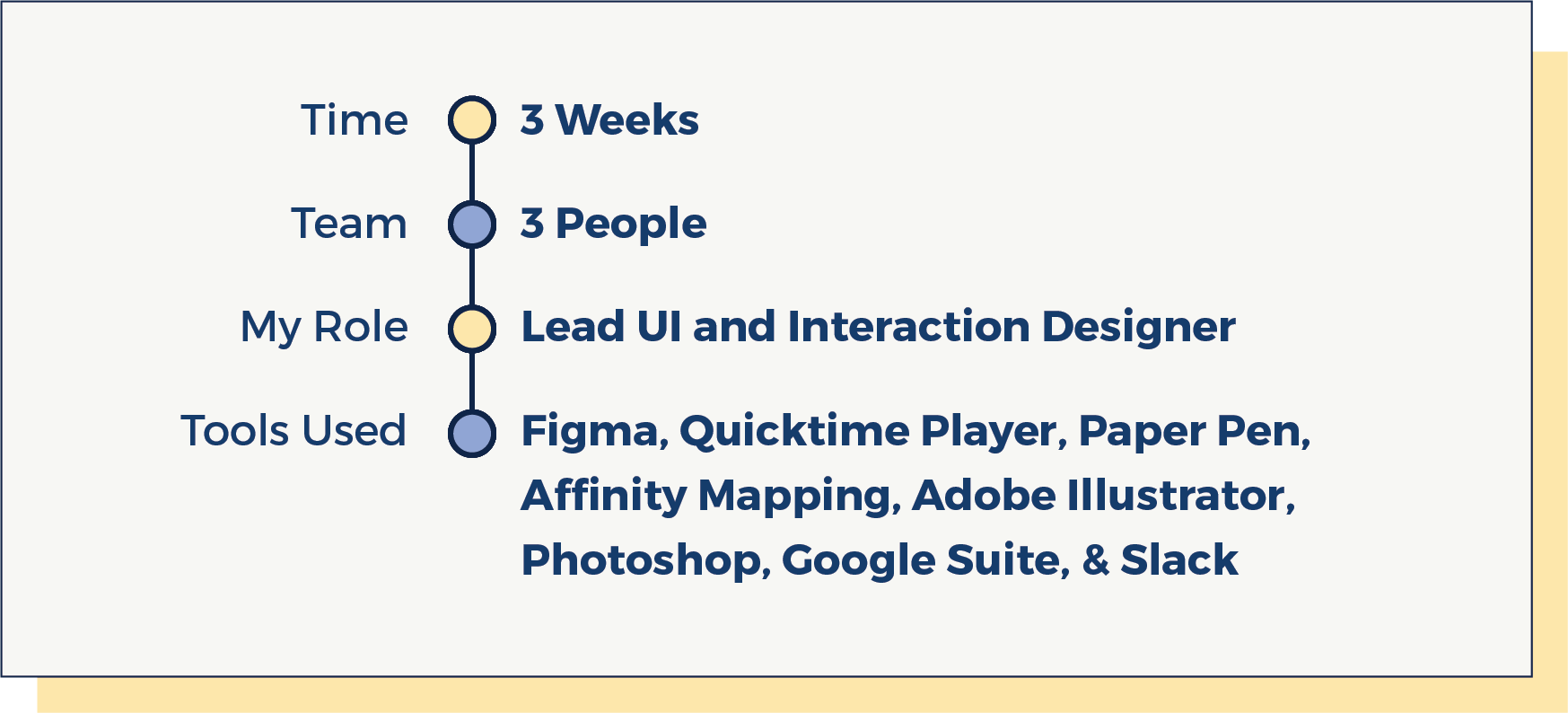
Project summary
Scriptly Rx is the only discount prescription drug app committed to transparency and social impact. I incorporated the business personality and simple navigational flow for the users.
Scriptly Rx is the only discount prescription drug app committed to transparency and social impact. I incorporated the business personality and simple navigational flow for the users.
Working with a team of two more designers, I researched, designed, and tested the redesign of the app with an onboarding experience.

What is the stakeholder's perspective?
In order to discover the high-level goals for this project, we brought in our stakeholder and asked him his top goals, needs, and success metrics for the duration of the sprint.
“I would consider Scriptly Rx a success if and when it becomes a major contributor to the extinction of the traditional PBM model.”

What are the challenges users face?
► The medications are too expensive
► They don't trust the pharmaceutical market
► They struggle to manage the medications
► They get confused by complicated drug names
► The medications are too expensive
► They don't trust the pharmaceutical market
► They struggle to manage the medications
► They get confused by complicated drug names
What solutions can we provide?
► We created an onboarding experience to educate the user that Scriptly Rx believes in transparency so they can trust the business. Also, the onboarding will explain the process of using the coupon.
► We built a feature that will track the used coupons and thus providing the history of the drugs and pharmacies they were redeemed at. The app can be password protected to keep it private.
► Since our target audience are mainly people whose first language is not English, our solution was tailored to provide a language version of the app.
We conducted user interviews and a survey on the current app to find what works well and what doesn't.
We wanted to dig into why things are the way they are. I believe, when you’re presented with a problem from someone, you’ll spend the necessary time digging into all sorts of facets of the problem to really understand what it is we are tasked with.

User interviews
► We conducted 12 user interviews and we found out that not everyone was aware of the concept of using a coupon for their prescriptions.
► We conducted 12 user interviews and we found out that not everyone was aware of the concept of using a coupon for their prescriptions.
► Users had trouble finishing the task with the current app.
Survey findings on current app
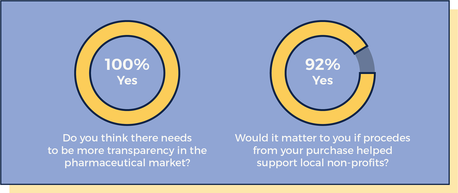
► We sent out our survey on social media and received 12 responses.
Click here if you would like to read the survey.
► We sent out our survey on social media and received 12 responses.
Click here if you would like to read the survey.
► We learned that people do not trust the pharmaceutical market and most people liked that proceeds from their purchase will help support local nonprofits.
We researched on competitors apps to learn what others are doing in the market and later did affinity mapping on the findings.
Competitor analysis
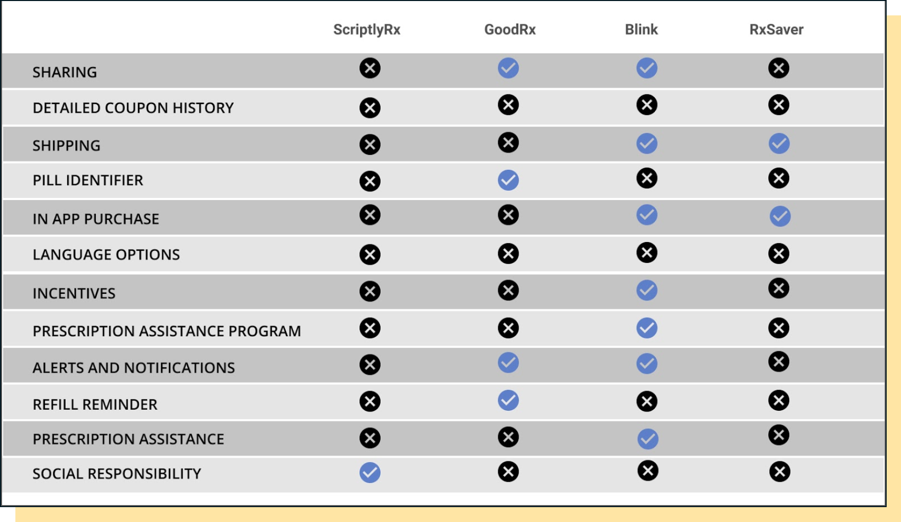
► GoodRx, Blink, RxSaver are the three main competitors that I referred to. Most of them are already doing good in Sharing, Shipping, Reminders, Alerts, and Notifications where Scriptly Rx lacks but what makes Scriptly Rx stand out from the rest is that it provides transparency and social impact.
► GoodRx, Blink, RxSaver are the three main competitors that I referred to. Most of them are already doing good in Sharing, Shipping, Reminders, Alerts, and Notifications where Scriptly Rx lacks but what makes Scriptly Rx stand out from the rest is that it provides transparency and social impact.
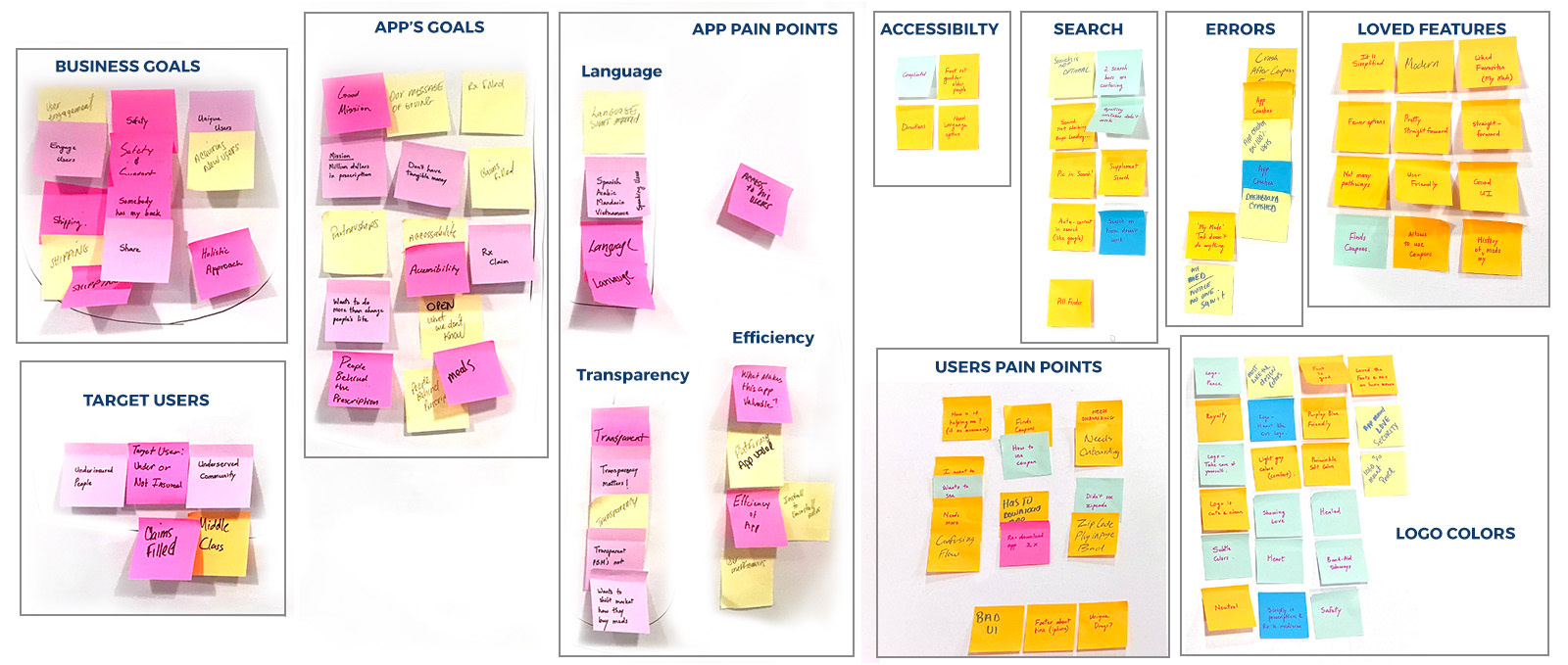
Affinity mapping helped us find our potential features of the app.
We categorized the data findings from interviews, survey, competitor analysis and heuristics into mission/goals, efficiency, search, errors, loved features and user's pain points. The results gave us the potential features of the app and also led us to create our persona.
We categorized the data findings from interviews, survey, competitor analysis and heuristics into mission/goals, efficiency, search, errors, loved features and user's pain points. The results gave us the potential features of the app and also led us to create our persona.
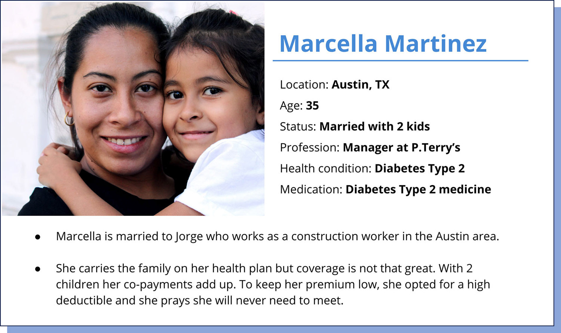
Building the persona
► Marcella needs an affordable way to refill her Type 2 diabetes medication.
► Marcella needs an affordable way to refill her Type 2 diabetes medication.
► She finds it difficult to trust drug prices and is not aware that she can save on drugs.

“I have a full time job and an insurance but it’s not enough, it’s not enough.”

Brainstorming with the team helped us visualize and sketch ideas.
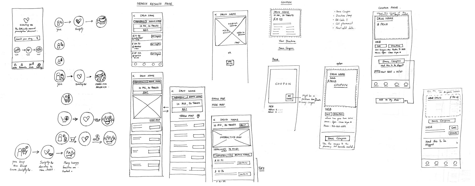
Brainstorming with the team helped us come up with a variety of ideas. I started with hand sketches to quickly visualize concepts and ideas for the redesign. Some of the initial ideas that I sketched was for home, find a coupon for your drug, coupon and my coupon pages.
Brainstorming with the team helped us come up with a variety of ideas. I started with hand sketches to quickly visualize concepts and ideas for the redesign. Some of the initial ideas that I sketched was for home, find a coupon for your drug, coupon and my coupon pages.
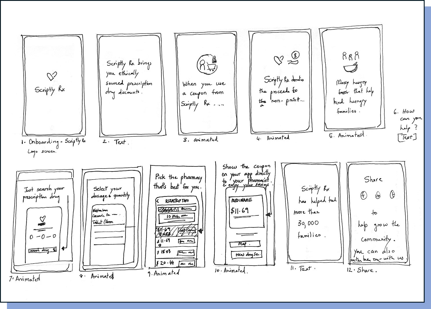
Storyboard for onboarding
► Onboarding was a necessary feature to add to educate the users about the transparency that Scriptly Rx provides and the social good, how they can help a non-profit with their purchases.
► Onboarding was a necessary feature to add to educate the users about the transparency that Scriptly Rx provides and the social good, how they can help a non-profit with their purchases.
► They also wanted to know how to search a coupon.
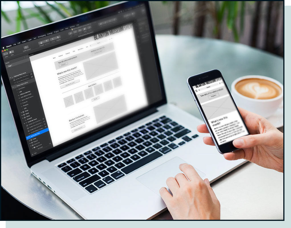
I created wireframes from the ideas that we sketched.
After rolling out some hand sketched ideas with the team, I explored options for low-fidelity wireframes (created in Figma for this project). It is fun and at the same time challenging to bring ideas to life from sketches to the computer with various concepts and layouts.
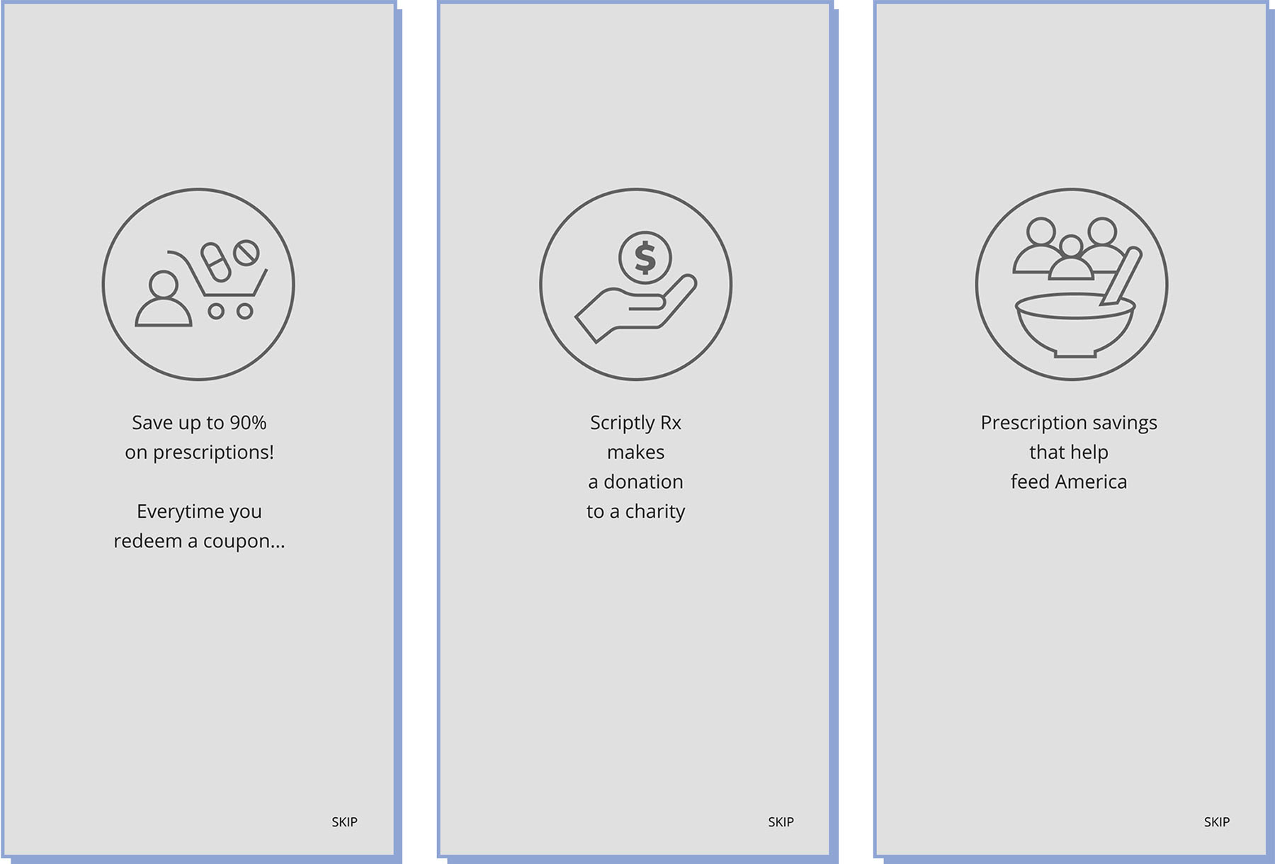
Initial wireframes for onboarding screens
We tested our app with five users.
We developed a wireframe prototype and tested users. We learned
a few things the way they interacted with it.
a few things the way they interacted with it.
Usability testing takeaways:
► Users wanted control of going to the next steps on the onboarding process (It was set to automatically go on to the next screen).
► Users wanted to redeem the coupon, not just save it.
► Users wanted to know how to make a new search.
► Users wanted control of going to the next steps on the onboarding process (It was set to automatically go on to the next screen).
► Users wanted to redeem the coupon, not just save it.
► Users wanted to know how to make a new search.
Learning from users after the testing, we made some important iterations.
Our testing led us to make many changes through the wireframes, solving as many issues as we thought seemed important in our designs. After a few more iterations of this, I took the lead and made sure that our entire design was cohesive and flowed more naturally.
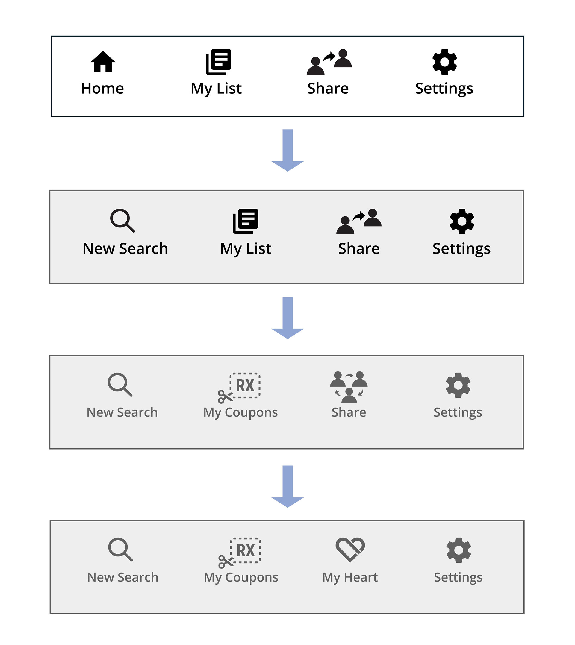
Iterations I made on the footer:
► I initially had a Home button that took the users to the homepage where the search bar lives. Because the users got confused on how to make a new search, I replaced the home button with a search icon and called it New Search.
► The My list button worked only for some of the users. Others wanted to know where will the coupons be saved. So, to make it clearer, I changed that to My Coupons.
► The Share button changed to My Heart on the request of stakeholder. Sharing can be found on each coupon page and also lives in My Heart page.
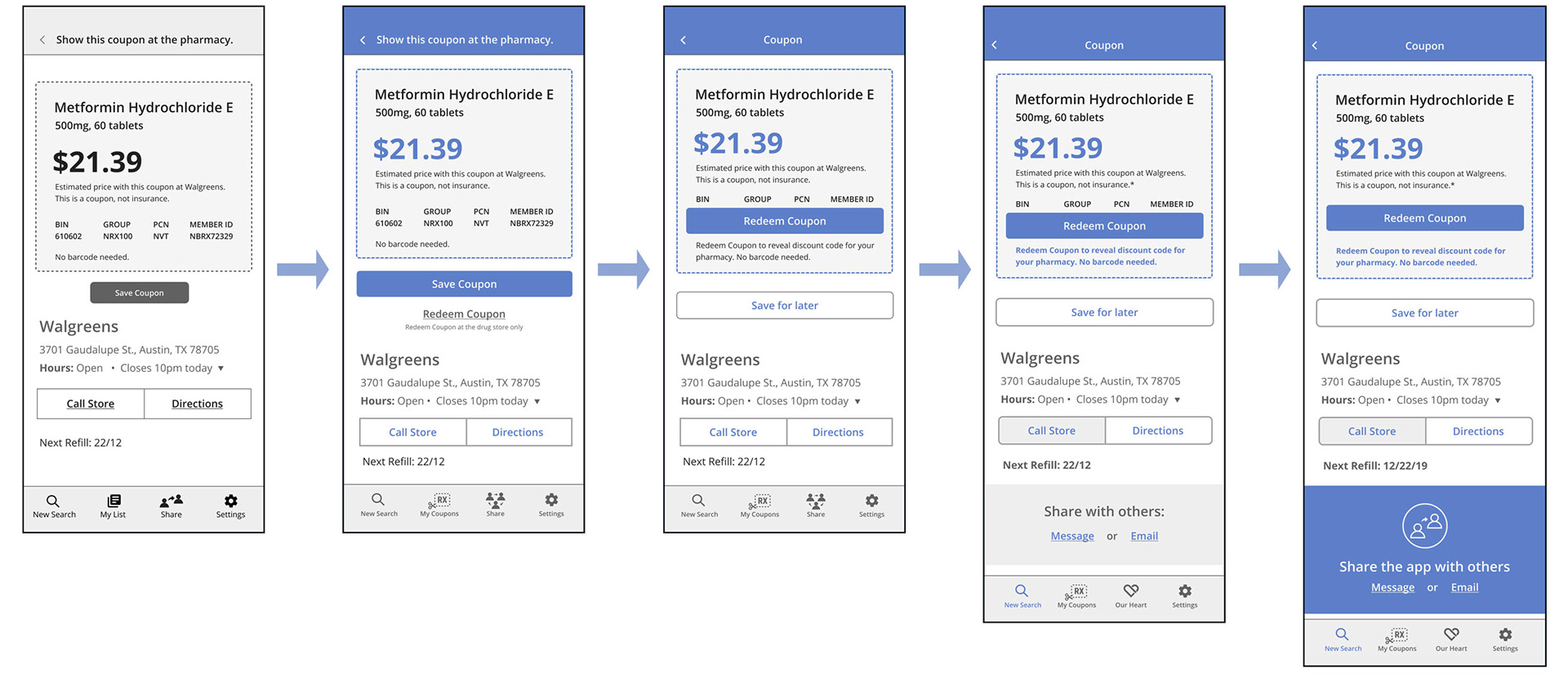
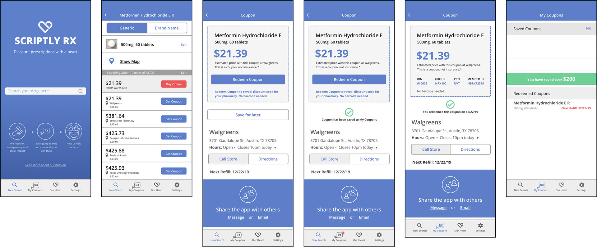
Iterations I made on the coupon page:
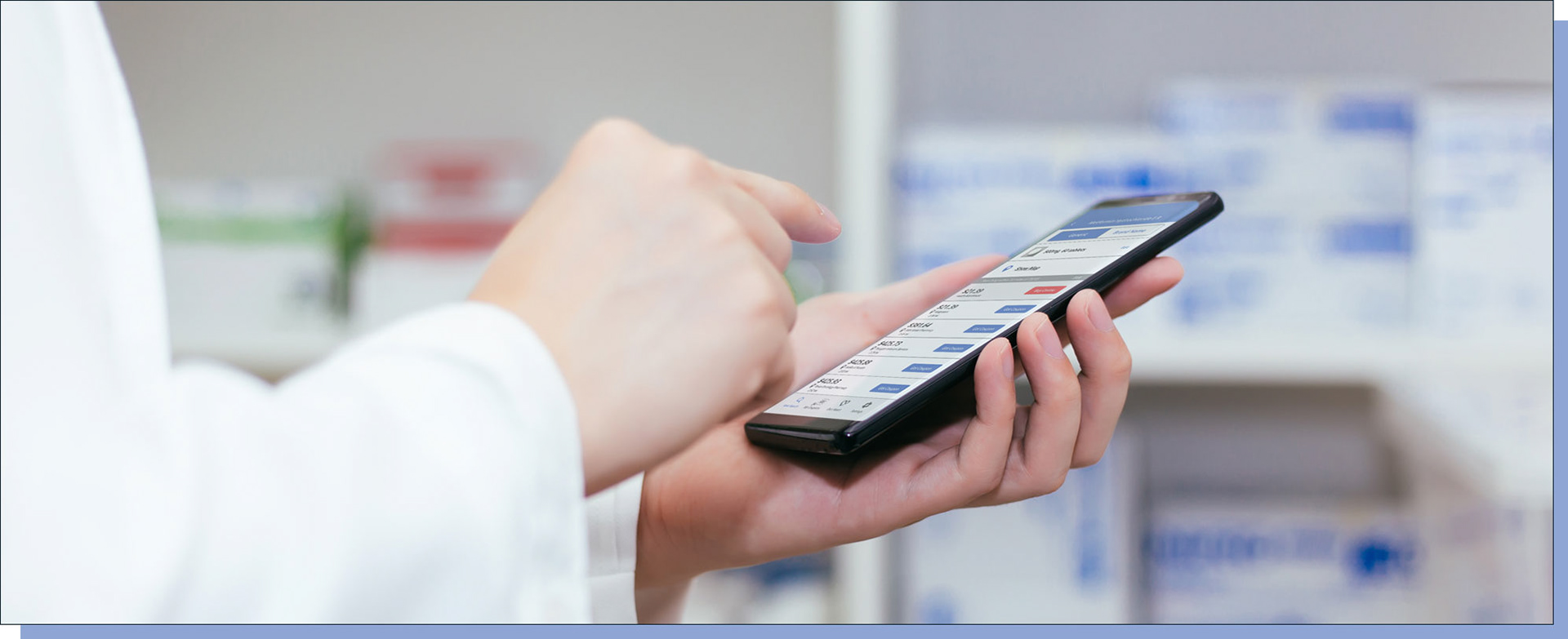
► I added a Redeem Coupon button in addition to the Save Coupon button. They both have different functionality.
► Initially the bin, group, PCN and Member ID number was visible on the coupon. After usability testing I hid it. The Redeem coupon button will reveal the codes that the pharmacist needs to apply the coupon for the drug. The coupon will also get added to the history in My Coupons.
► The users will be able to share the app with their family and friends via the message app or can email them.
Iterations on coupon page
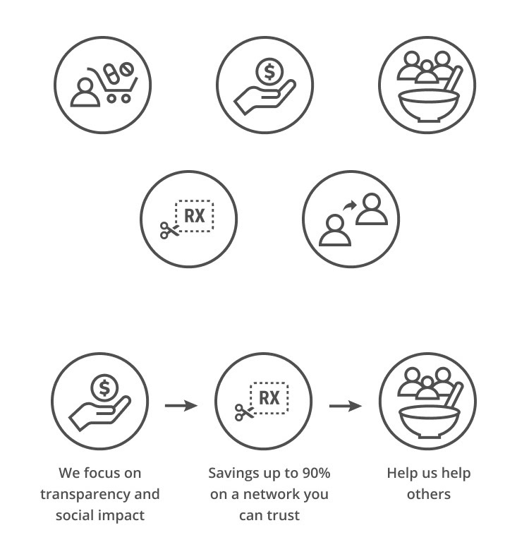
Icon design
► I designed some icons based on business personality

Mockup
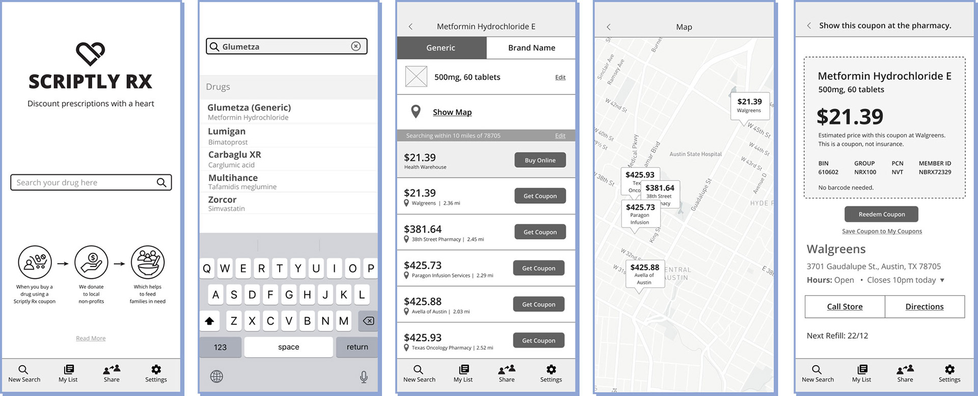
► The stakeholder wanted to keep their style guide, so I worked within that guidelines. I created a style guide of colors and fonts based on the existing one for the mockup of our app design.
Mockup of a few screens that I created
Prototype
► I then made the app functional for a more in-depth and accurate experience. View the prototype in action or click here to interact with the app.
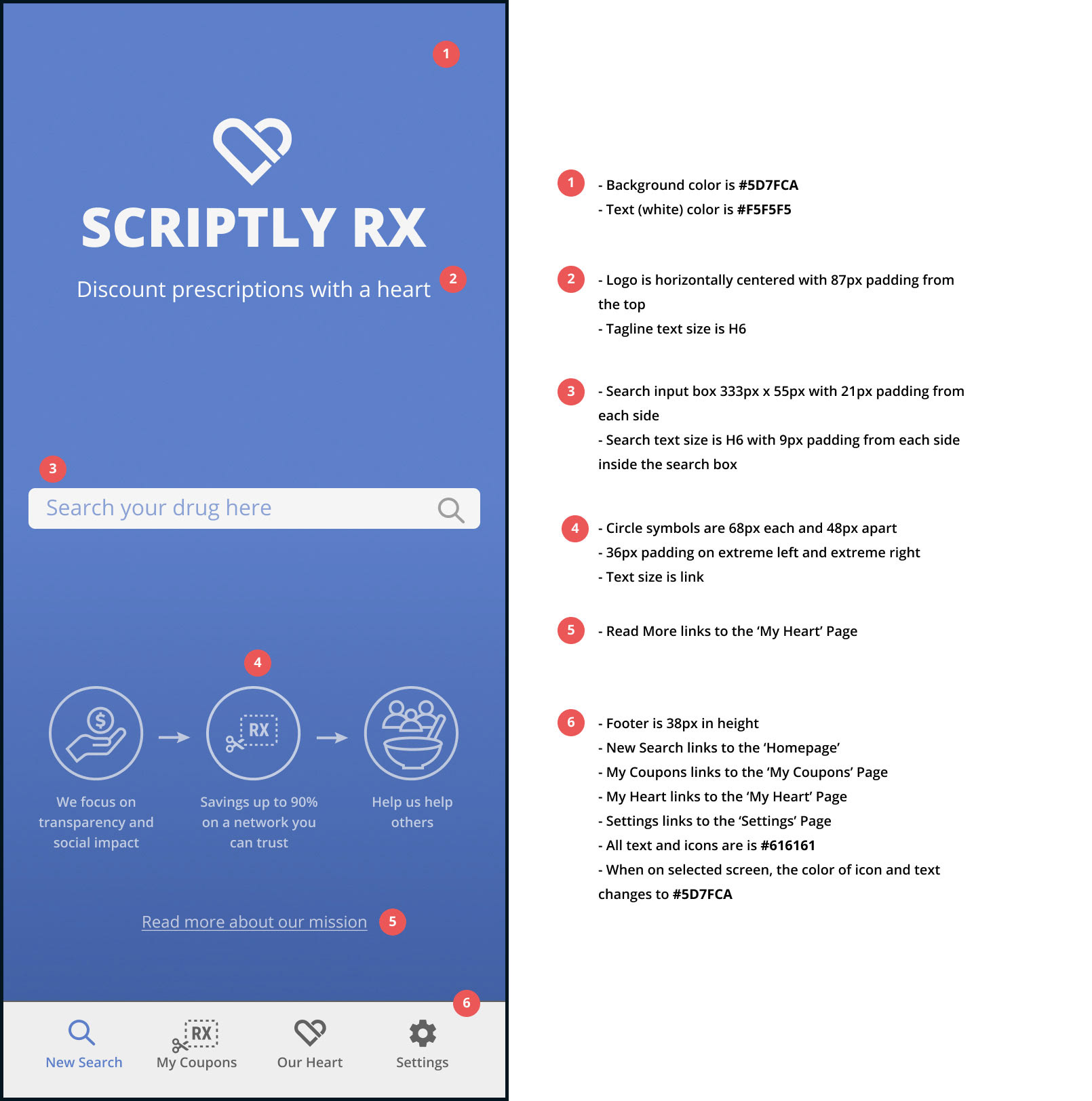
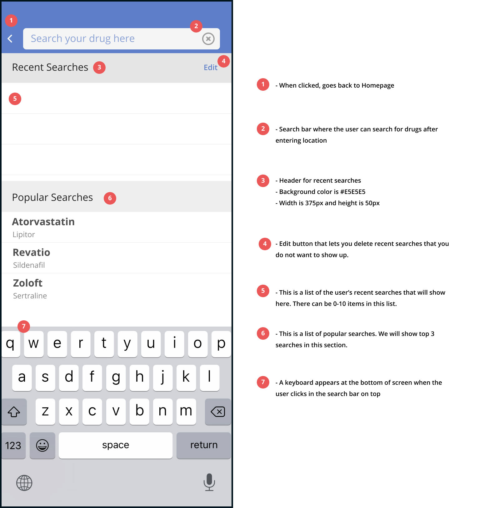
Annotations
► I created annotations to share it with the stakeholders. The extra information will not only help him understand the functionality associated with particular points but will also give key information to the developer while coding the app. Below is the detailed description that indicates the specs, color codes and functionality.
Retrospective
Overview
► Our team felt satisfied that we designed a delightful solution to problems both the user and the business were facing. The additional interface to the existing app would create ease and convenience for the customer and would increase overall transactions with Scriptly Rx.
► Our team felt satisfied that we designed a delightful solution to problems both the user and the business were facing. The additional interface to the existing app would create ease and convenience for the customer and would increase overall transactions with Scriptly Rx.
What went well
► The planning and ideating went really well in our project, as well as the timeliness of our deliverables. We used a Trello board to organize our team efforts and took time in the beginning to get to know each other's strengths and weaknesses. This paid off big-time when it came time to divvy up the tasks.
► The planning and ideating went really well in our project, as well as the timeliness of our deliverables. We used a Trello board to organize our team efforts and took time in the beginning to get to know each other's strengths and weaknesses. This paid off big-time when it came time to divvy up the tasks.
What I learned
► During this project, I was able to really explore how much a user's needs aligned with the business and use that information to design an experience that would benefit them both.
► During this project, I was able to really explore how much a user's needs aligned with the business and use that information to design an experience that would benefit them both.
► Taking the time to extensively research into Scriptly Rx and its competitors allowed me to really see what was missing, and what was the most important.
► Working with a team was both exciting and, at times, a bit frustrating. We used slack channel and at times also iPhone messages so that our communication was fast. We used google suite extensively for all of our files so that any one of us could have access to each other's research and deliverables at all times.
► Overall, it provided a great learning experience in how everyone has different ideas that come together as great results and learned how to address concerns.
Next Steps
If we continued the project, we’d like to tackle the following next steps and test again, once the new design is live.
If we continued the project, we’d like to tackle the following next steps and test again, once the new design is live.
► Built out the share feature
► Have the app in Spanish language
► Add a pill finder to identify pills with shape, size and color
► Icon that represents the drug in the search bar
► Have the app in Spanish language
► Add a pill finder to identify pills with shape, size and color
► Icon that represents the drug in the search bar