
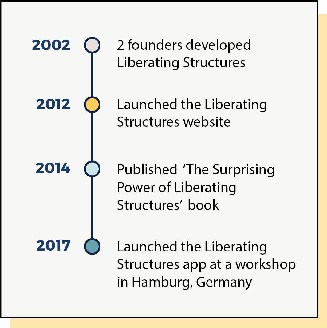
What are Liberating Structures?
► Liberating Structures are a selection of structures for facilitating meetings and conversations. They are interaction methods that enhance relational coordination and trust in the team.
► This app helps you to get started using Liberating Structures by serving you as a practical Workshop Companion that is always at hand.

Overview
My team was asked to design a new feature for 'Liberating Structures' app in order to meet a business goal.

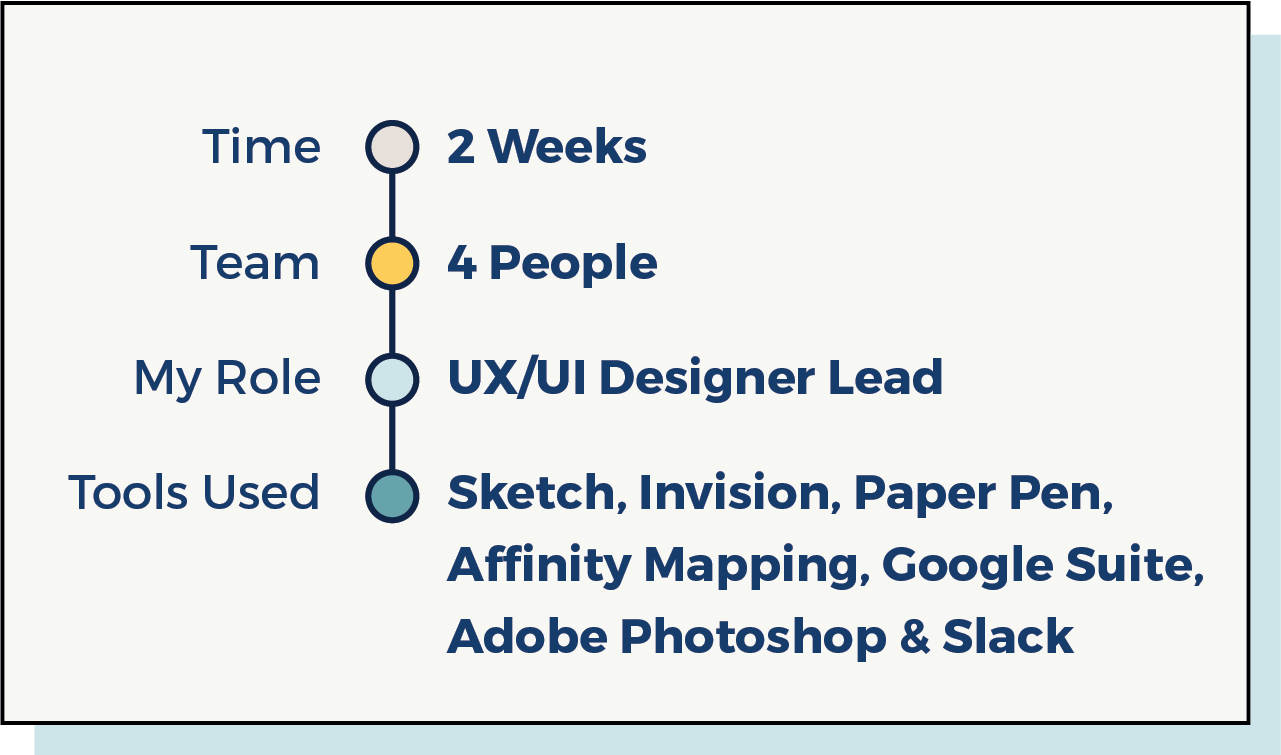
My Team and My Role
► We formed a team of four designers and all of us contributed our skills to each phase of the project.
► In my role as a UX/UI Designer Lead, I was responsible for User Research, Competitive Research, User Flow, Initial Sketching and Ideation, Low-Fidelity Wireframing, High-Fidelity UI Design, and Prototyping. I was essentially responsible to bring life to our ideas.
What are the current challenges with the App?
► The current app is only a list of all the structures with all the details but no interaction. This makes it complex and difficult to understand for a new user.
► The user’s journey is intricate because the new user does not know how to find a structure that's relevant.
► The user’s journey is intricate because the new user does not know how to find a structure that's relevant.
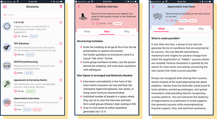
Screenshots of the Liberating Structures App (2019)
We came up with a solution of...
► Creating an intuitive, interactive application that walks the user through the process of discovering a structure that will enhance relational coordination and trust.

How did we get started?
We kicked off the project with a team meeting, brainstorming our manifesto and coming up with a project plan. Read ahead about our journey and how we reached the final MVP feature of the app.

We Researched and Analyzed Competitors
► Liberating Structures was initially designed as a website with lots of complex content that mystified users who are not aware of this space. There were no direct competitors in this space.
► A lack of true competitors led us to indirect competitors/inspirations. We researched if they have a Guided selection process, Curated selections, Search or Filters and checked out their Visual design.
► A lack of true competitors led us to indirect competitors/inspirations. We researched if they have a Guided selection process, Curated selections, Search or Filters and checked out their Visual design.
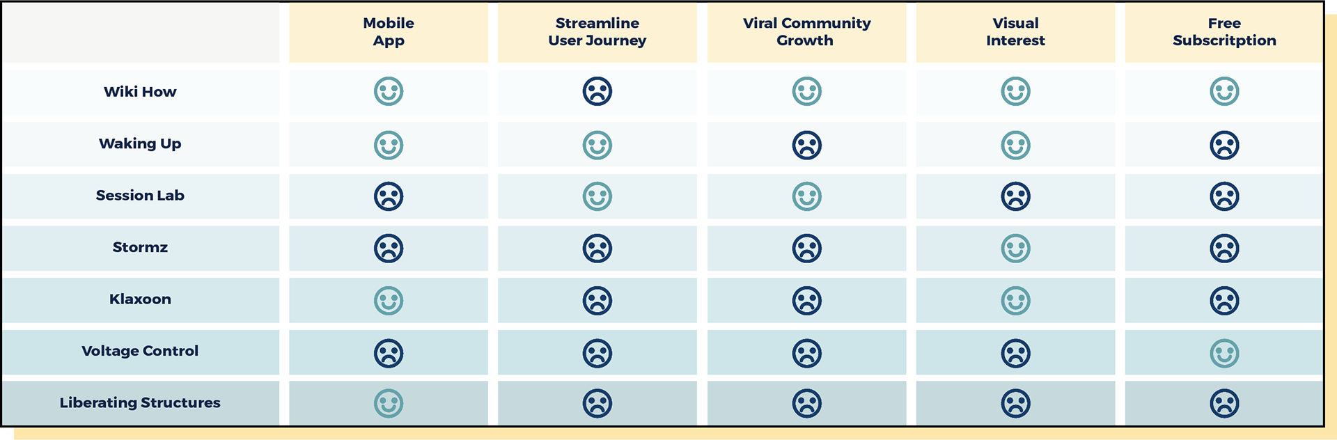
Competitive Analysis Chart from 6 indirect competitors
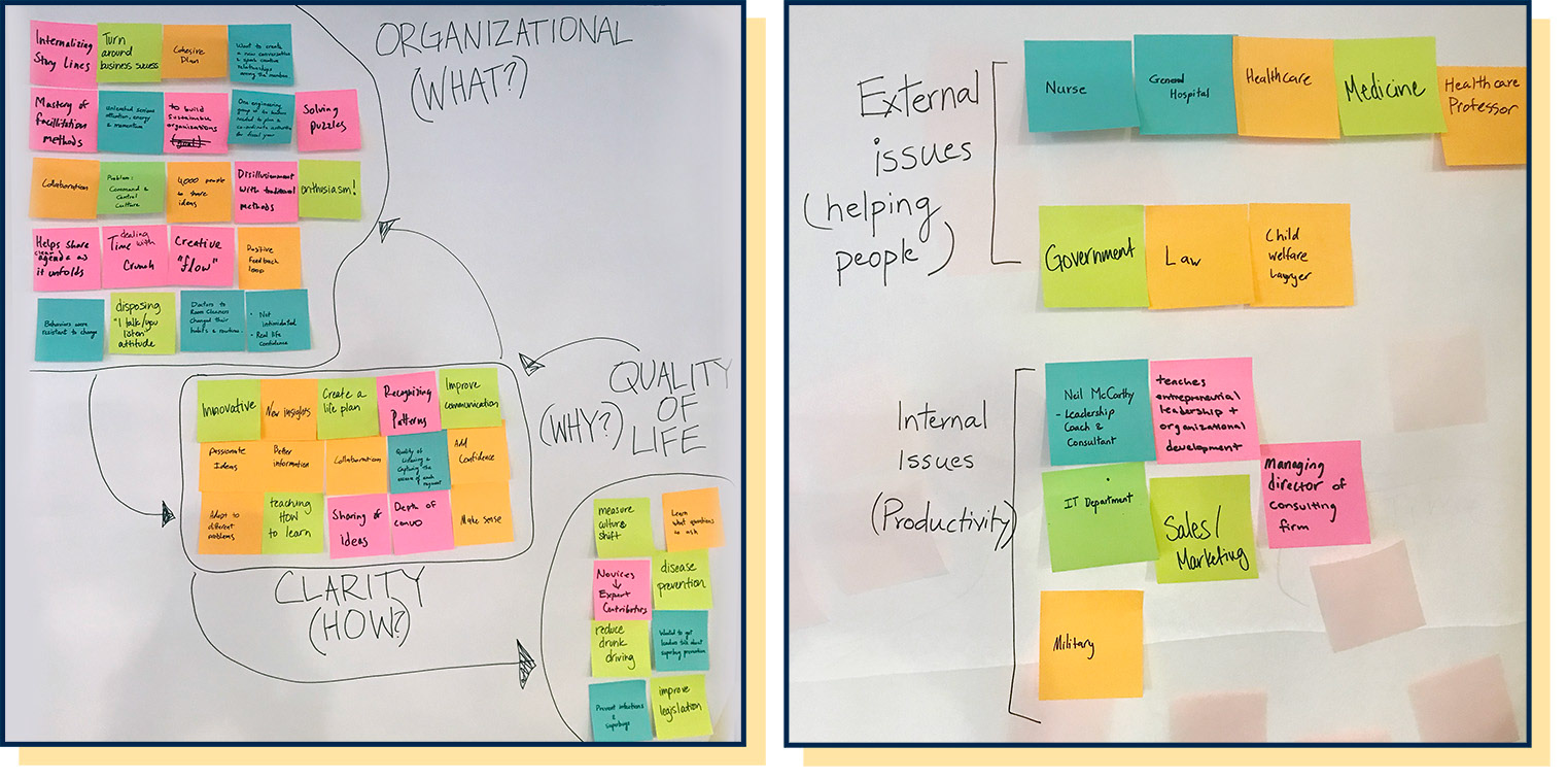
Given our new knowledge of our user, we drafted a research-based Persona.
► Samara's job requires her to collaborate with physicians, patients, nurses, therapists, social workers and other members of the patient care team to develop a patient specific care and treatment plan.
► During a medical conference in Austin, she was introduced to Liberating Structures. She wants to use this practice to improve the efficiency of her new team. She needs an app that helps her facilitate a Liberating Structure workshop.
► During a medical conference in Austin, she was introduced to Liberating Structures. She wants to use this practice to improve the efficiency of her new team. She needs an app that helps her facilitate a Liberating Structure workshop.
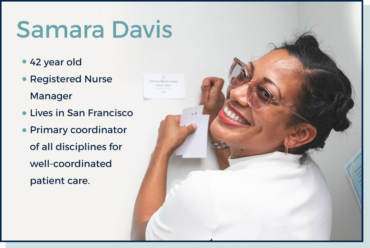
"I want my team to work as effectively as possible so that we help save lives more efficiently."
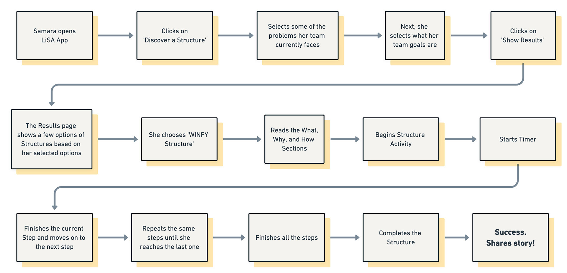
We considered the ways in which Samara might interact with the App
► Samara is looking for a structure that is a right fit for her team. She opens the app and is drawn towards the well placed `Discover a structure` feature on the homepage.
► Next, she goes through the interactive filtering process and selects WINFY structure for her team. She wants to start facilitating the structure. So, she hits Begin and she is guided through our `step by step` feature. When she completes it she can share her success with the Community.

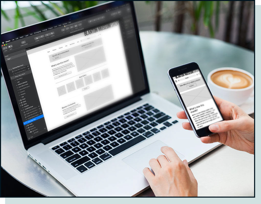
Creating our designs: Once we had discussed our initial project plan, we began ideating around possible design solutions. We started with sketches and then moved into digital wireframes once we had a solid direction.

Initial Sketching and Ideation
► After brainstorming with the team on what key features to add, I sketched out some initial ideas for home, structure, timer, and discover pages.
► After brainstorming with the team on what key features to add, I sketched out some initial ideas for home, structure, timer, and discover pages.
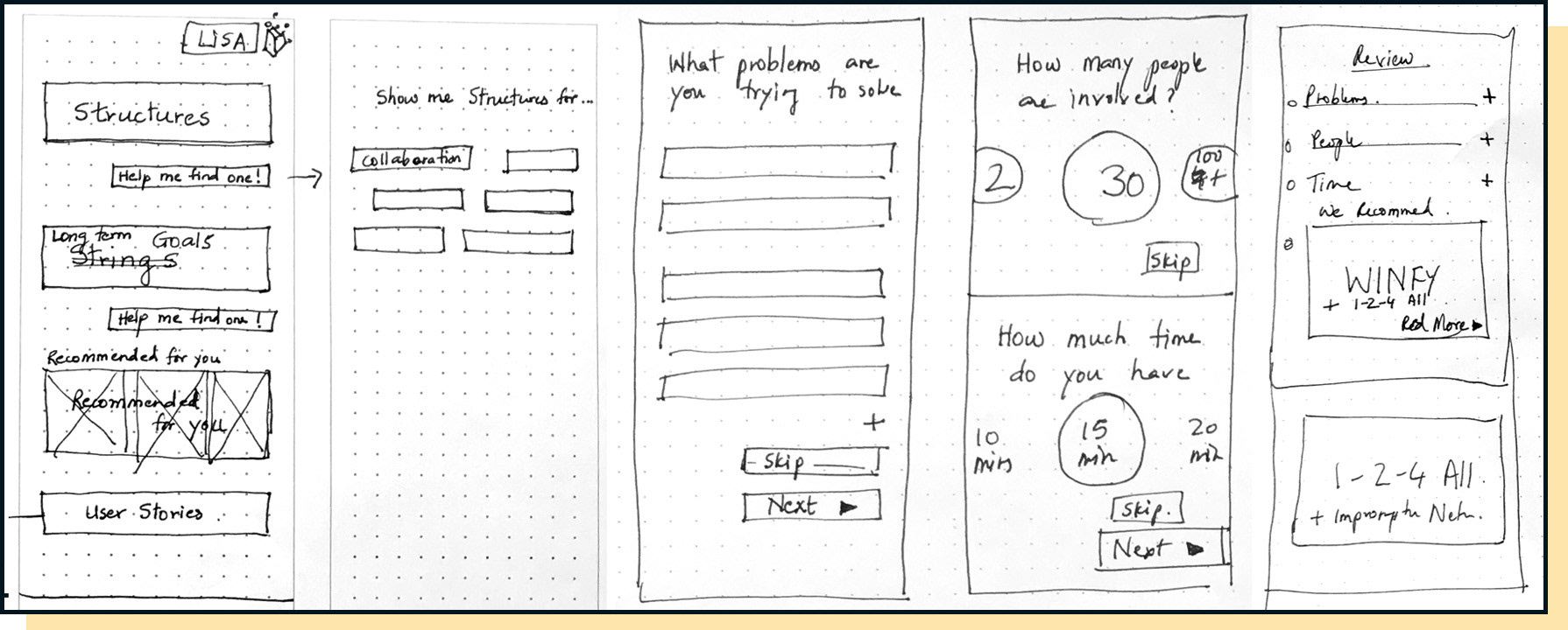
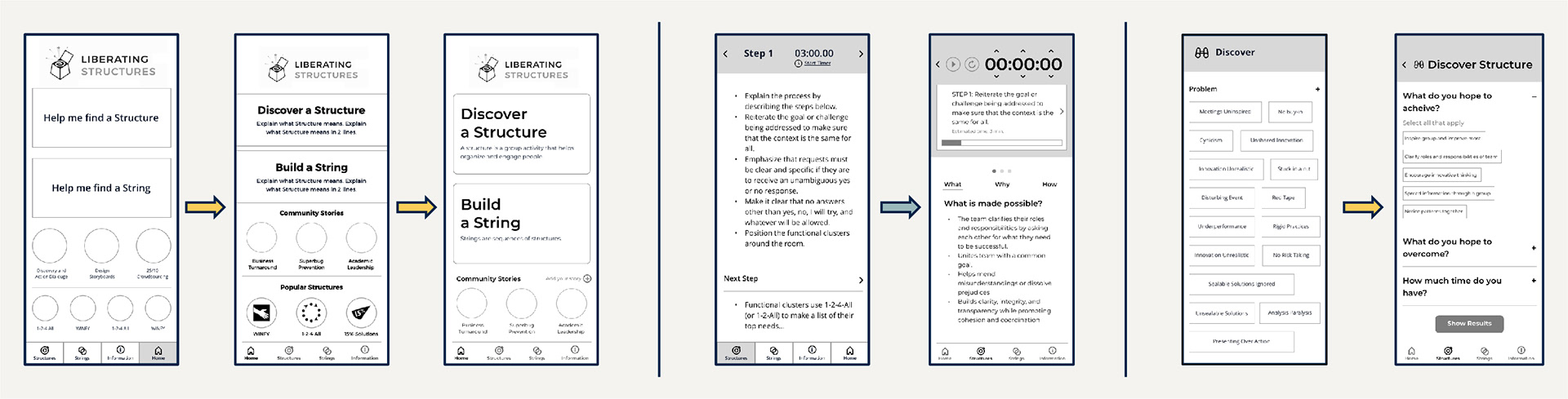
Low-Fidelity Wireframes and Prototyping
After we picked the most important feature, I moved on to creating the low-fidelity digital wireframes. With a short turnaround time we prototyped the wireframes and tested them with users. These wireframes included CTA for 'Discover a Structure', 'Build a String' and 'Community Stories', Footer, Header, CTA for 'Begin Structure', Success page and ways for users to continue exploring.
Key Findings and the Changes made
After the Usability testing we got together and discussed the findings, brainstormed and made changes to our wireframes. The Iteration process made our feature even better and stronger.
2/4 users couldn't find the 'Begin' Button never even tried to click it.
4/4 users went for 'Help me find' right away
4/4 users, even experienced ones want guidance in selecting structure
4/4 users commented on favoriting feature.
4/4 users confirmed that discover “filters” are the kind of information they want to narrow what they are looking for
0/4 users used the “sort” button
4/4 users did not understand “recommended” section on homepage
4/4 users talked about the community
3/4 users might not write their own stories/case studies, but they wanted that information.
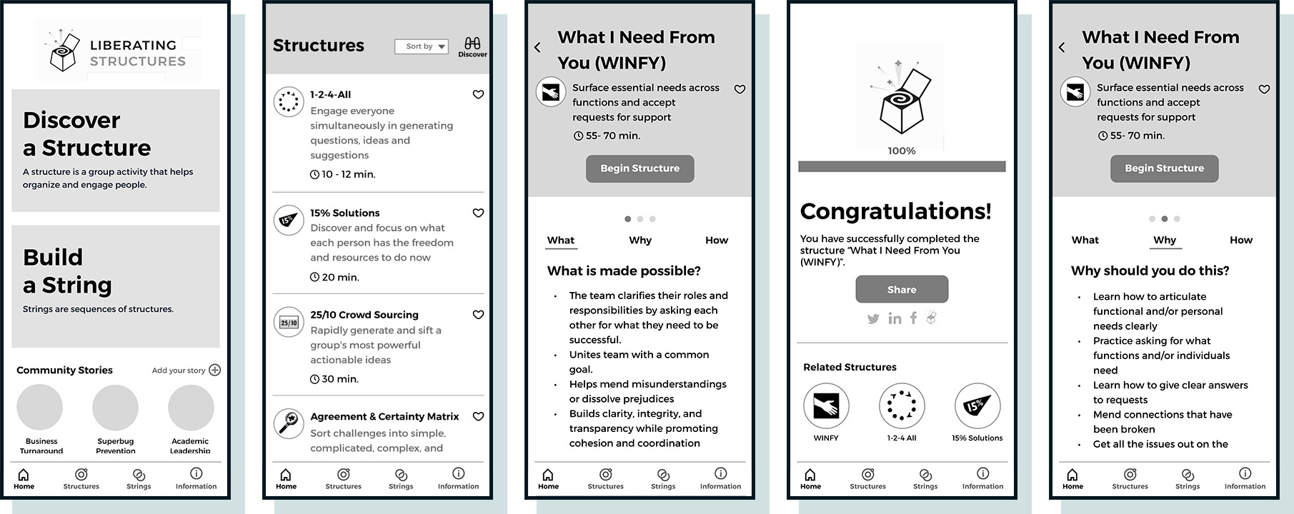
Hi-Fidelity Mockup
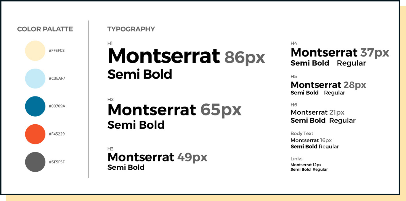
► After a lot of iterations, I selected colors and fonts that were apt for this app and created a Style guide.
► I moved on to hi-fidelity Mockup. With short turnaround times, another team member helped me with some of the pages.
Challenges we faced
► To find real users who are aware of this space was challenging.
► One design concept that we prototyped was displaying lots of options in 'Problems' and 'Goals' to choose from in the Discovery process. When users tried that, they got overwhelmed with the options.
► Copywriting and language for users were the biggest challenges we faced because of lack of subject matter experts.
What we learned
► Because of this project, we learned about Liberating Structures and about the Users.
► We realized the importance of prototype testing for exploring new design concepts. It made us identify the areas of opportunity to make sure they were viable solutions before putting in the development effort.
► We realized the importance of prototype testing for exploring new design concepts. It made us identify the areas of opportunity to make sure they were viable solutions before putting in the development effort.
► We tried to simplify the language as much as we could and use simple terms that people would understand.
Present: Once we created the high fidelity mock-up, the next step was to present our learnings and the new app feature to our stakeholders.
Summary and Next Steps
Although we had so many ideas about new features that we would have liked to incorporate, we recognized the value of time but also acknowledged that by no means does the journey end here. Here are some of our other ideas:
► Community Stories functionality
► Simplified Copywriting
► Create String features
► Glossary of terms
► User Profile/Accounts
► Onboarding feature
Conclusion
► The start of this project was kind of daunting and a challenge for us. We were required to quickly understand this space and know about our users.
► I feel like we really went above and beyond by buying the book, reading Community Stories and medium articles to understand our users.
► I learned a lot and it was interesting to know how everyone thinks differently and the great part of being in a team is that you listen, co-ordinate and collaborate!
► I learned a lot and it was interesting to know how everyone thinks differently and the great part of being in a team is that you listen, co-ordinate and collaborate!