
Overview
I was tasked with designing an online store (with wireframes) for the shop at The Blanton Museum of Art. The visitors want to buy the museum's dynamic collection with the convenience of online shopping but cannot.

How can I create an online experience for the Blanton Museum shoppers?

What needs to be known?
► The Blanton Museum of Art is the primary art collection for the city of Austin with nearly 18,000 works in the collection. It is a major resource for the community that sells unique and exclusive products at its Museum Shop.
► Their target audience consists of artists, local visitors, and tourists.
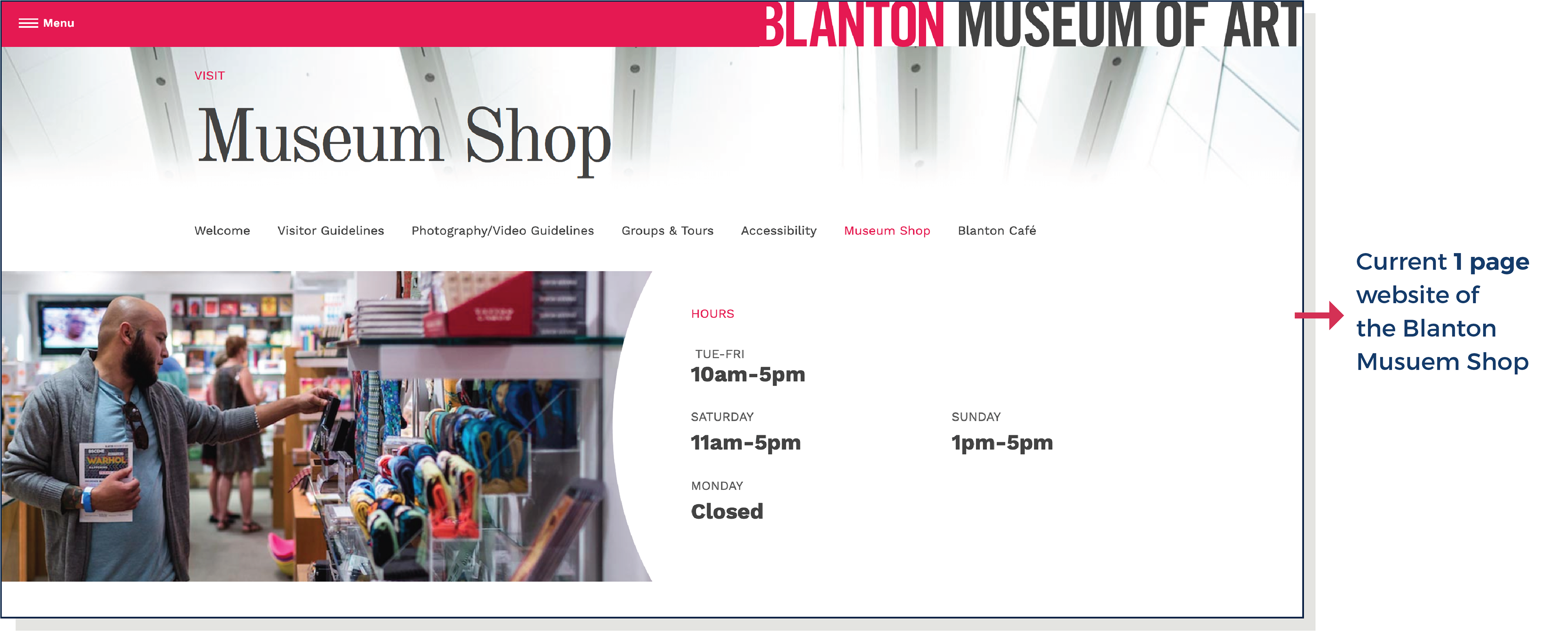
► They currently do not have an online shop that sells the products. This limits their sale only to the number of foot traffic in-store and losing potential customers who might shop online for various reasons. You can only view their products on Pinterest for inspiration.
► Their target audience consists of artists, local visitors, and tourists.
► They currently do not have an online shop that sells the products. This limits their sale only to the number of foot traffic in-store and losing potential customers who might shop online for various reasons. You can only view their products on Pinterest for inspiration.
► The Blanton Museum of Art has a well established website with a style guide. And The Blanton Museum Shop will follow a similar style guide for consistency.
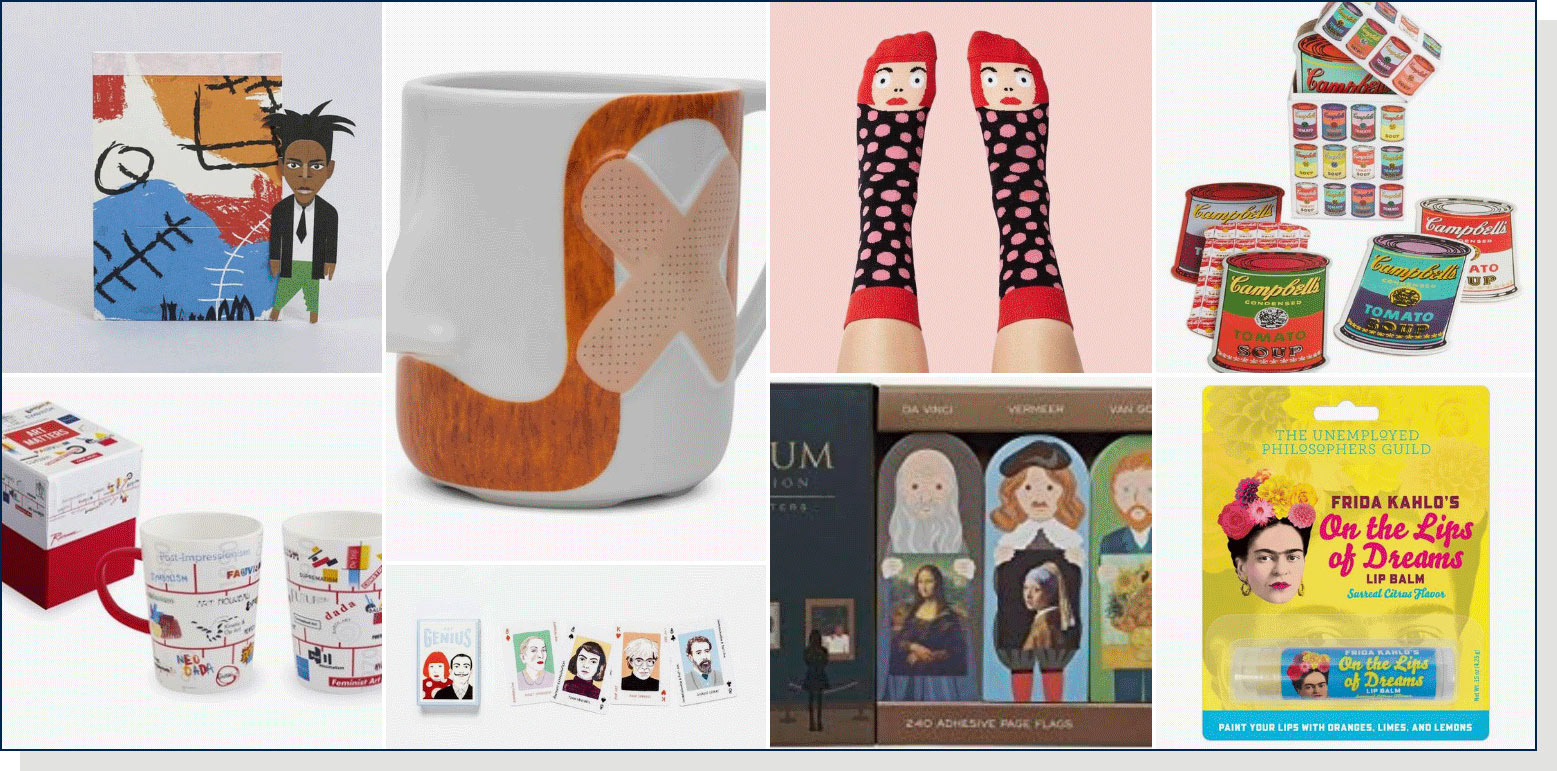
Blanton Museum Products on Pinterest
What are the current challenges
that I identified?
that I identified?
➊ Finding unique items made by local artists that are not typical souvenirs can be a tedious job.
➋ I identified that the visitors who come to Austin for work are currently lacking a source where they can shop for locally made unique items with ease during their meeting/conference breaks or in the evening after work when the stores are closed.
➋ I identified that the visitors who come to Austin for work are currently lacking a source where they can shop for locally made unique items with ease during their meeting/conference breaks or in the evening after work when the stores are closed.
Getting started!
What are others doing in the market?
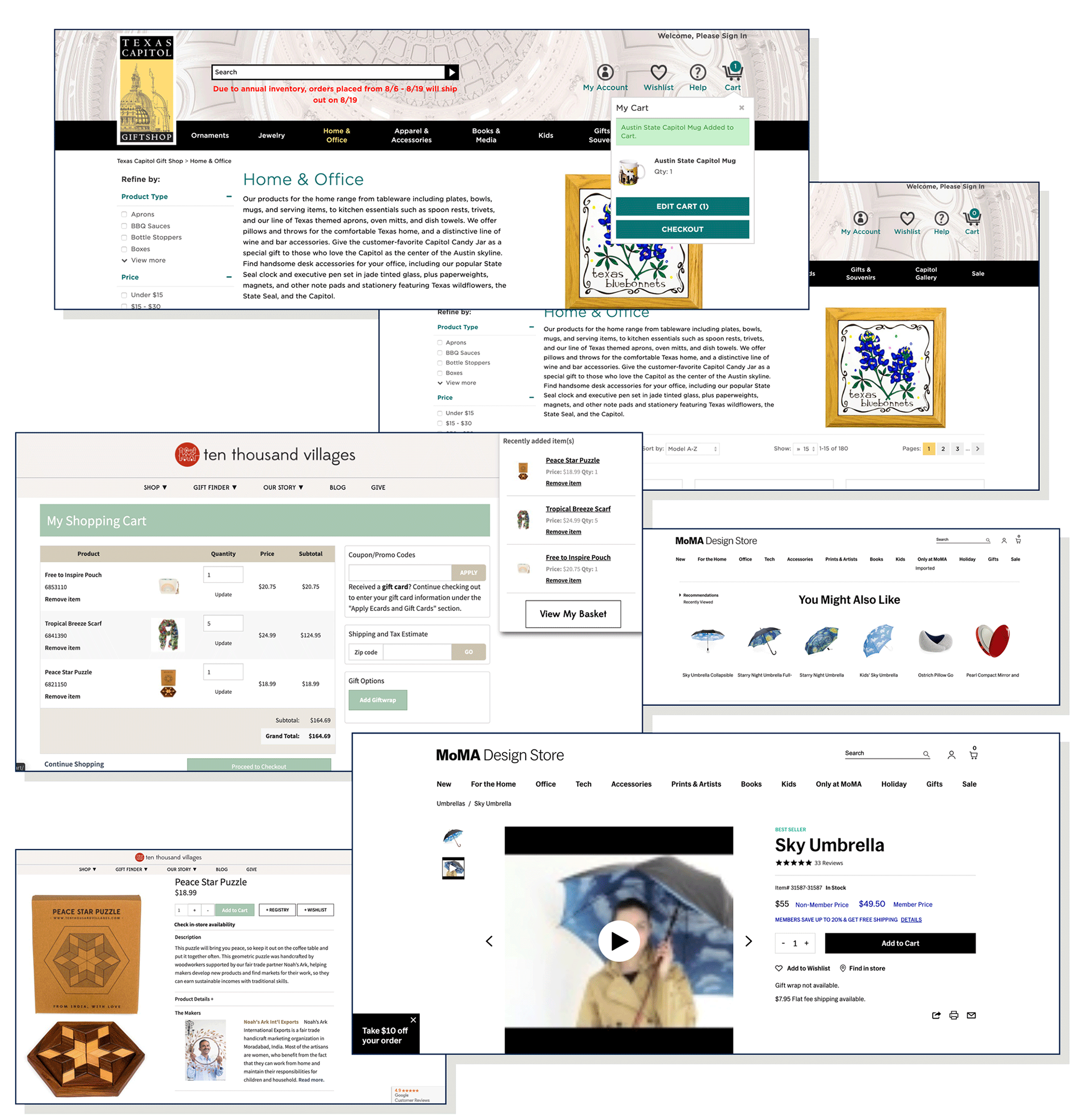
► I researched the competitors in the market. I visited their current websites to study and understand how they are presenting their brand and business, why they are doing it, what is working and what isn’t.

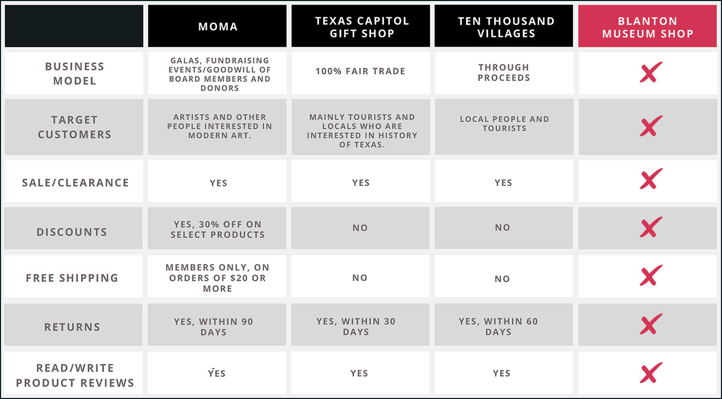
Competitive Analysis Chart
The 3 Competitors I picked are:
➊ MoMA Design Store
➋ Texas Capitol Gift Shop
➌ Ten Thousand Villages
These are popular stores with excellent online presence.
➊ MoMA Design Store
➋ Texas Capitol Gift Shop
➌ Ten Thousand Villages
These are popular stores with excellent online presence.
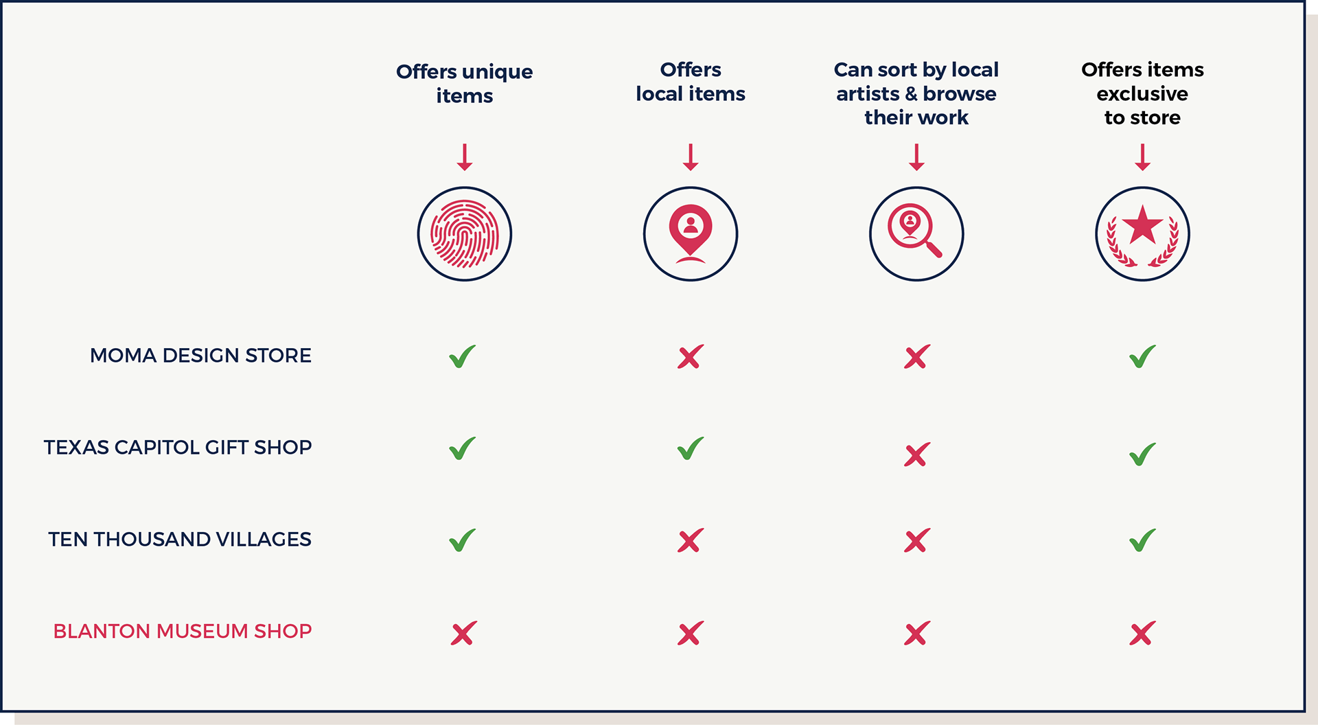
Comparative Chart
I learned that:
► All 3 online shops offer unique items. Some of them offer items made by around the world including some local artists but do not have an option to filter them by local artists.
► All 3 online shops offer unique items. Some of them offer items made by around the world including some local artists but do not have an option to filter them by local artists.
► I collected the data and then made a Competitive Analysis chart in Canva.
To solve the user's problems, I created a persona and a scenario
Meet Nikita Collins, my persona. She is 39 years old and works as a Product Manager. She lives in Denver, is married and has a 9-year-old daughter. Nikita is an avid traveler. She often visits different cities and countries for her client meetings and conferences. She loves shopping and collecting local, unique items for herself as well as for her family/friends to gift them on special occasions. She gets inspired by the local culture but does not find enough time to experience it in person at times.
“I want to take back some of the local culture from the cities that I visit”
— Nikita Collins

Persona - Nikita Collins
Her Pain Points are:
► Not much choice online
► Not enough photos of products
► Wants to be sure of minute details
► Lengthy checkout process
► Services that don’t work on mobile
My scenario is that Nikita shops online for locally made unique products and get them delivered to her home in Denver.
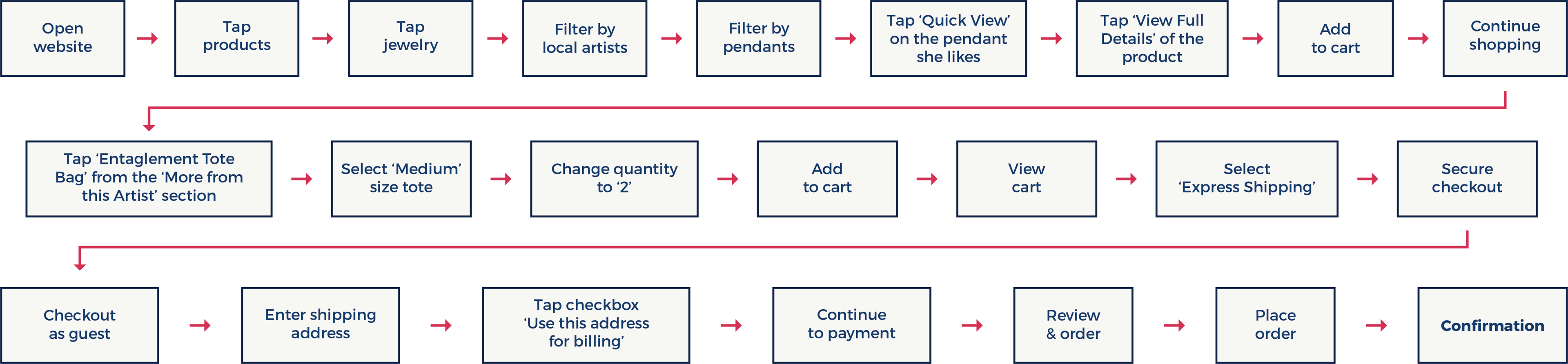
My scenario is that Nikita wants to buy a jewelry piece, specifically a pendant for herself from a local artist from an online shop since she is quite busy with her meetings during the day. She picks a pendant that she finds attractive and unique, likes the product pictures, description, details, and reviews. She adds it to the cart and then she sees this Tote Bag from the ‘More from this Artist’ suggestion section on the same page. She likes the artist’s work so much that she ends up buying the Tote for her friend’s upcoming birthday and the same tote for her artistic niece since as she realizes her niece would like it too!
Nikita's Goal: To be able to buy a jewelry product designed by a local artist.

Solution
My Solution is to create an online shopping experience that lets Nikita shop for a variety of locally made unique products emphasizing local artists with detailed description and photos, efficient check out process and fast shipping options that save her time. All these are also the priority features of my website.

Information Architecture & Design
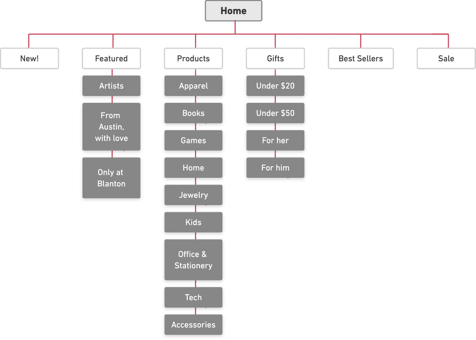
I identified and organized the information within a system in a purposeful and a meaningful way by creating a Site Map & Navigation.
Site Map
Sketching my ideas and making a list helped me create a Site map that’s simple enough for Nikita to navigate . I used an online tool Whimsical to create the site map.
Sketching my ideas and making a list helped me create a Site map that’s simple enough for Nikita to navigate . I used an online tool Whimsical to create the site map.
I started with sketches and ideation
Once I started putting down my thoughts on paper, I was surprised by how having rough visuals in front of my eyes leads to a better idea.
I kicked off the interface design process by sketching my initial ideas.
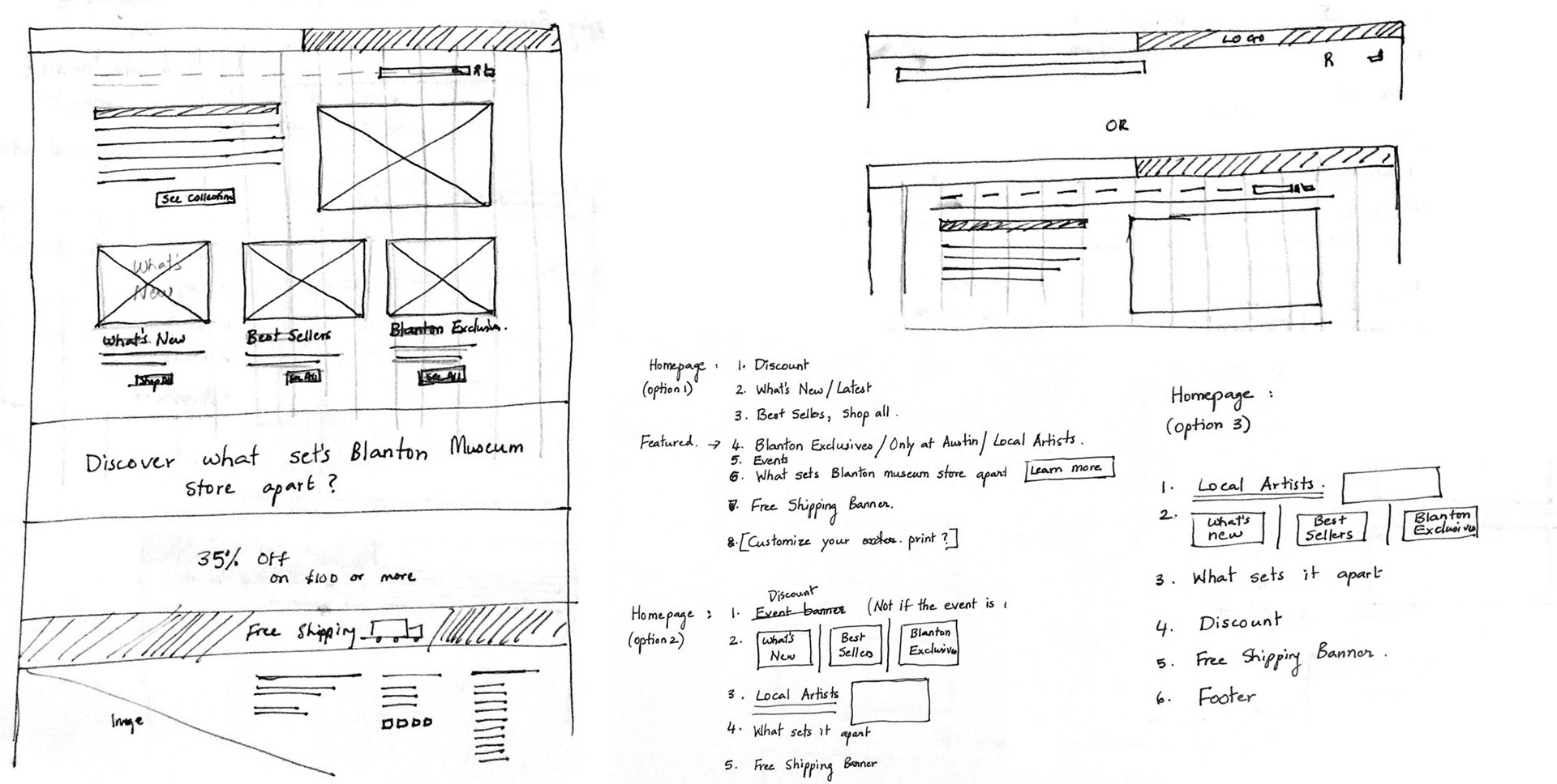
Homepage ideation

Sketching out Competitor’s current product pages led to ideation for my website’s product pages
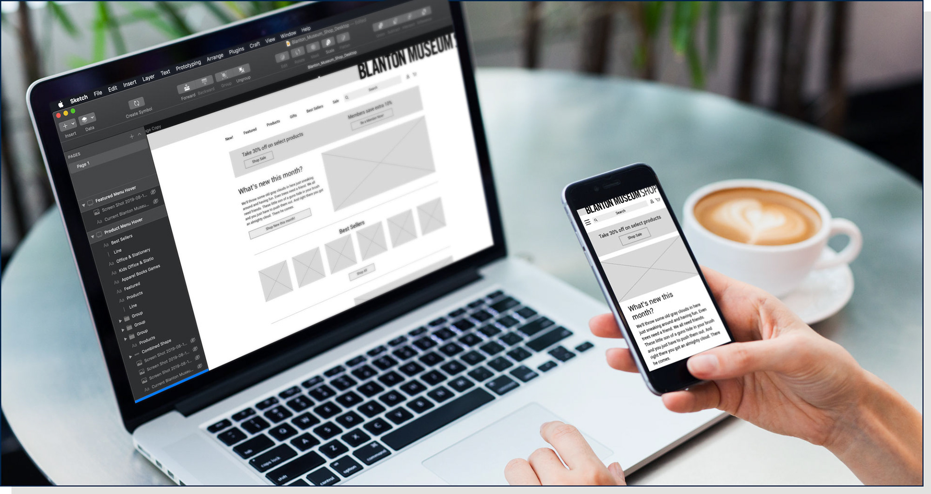
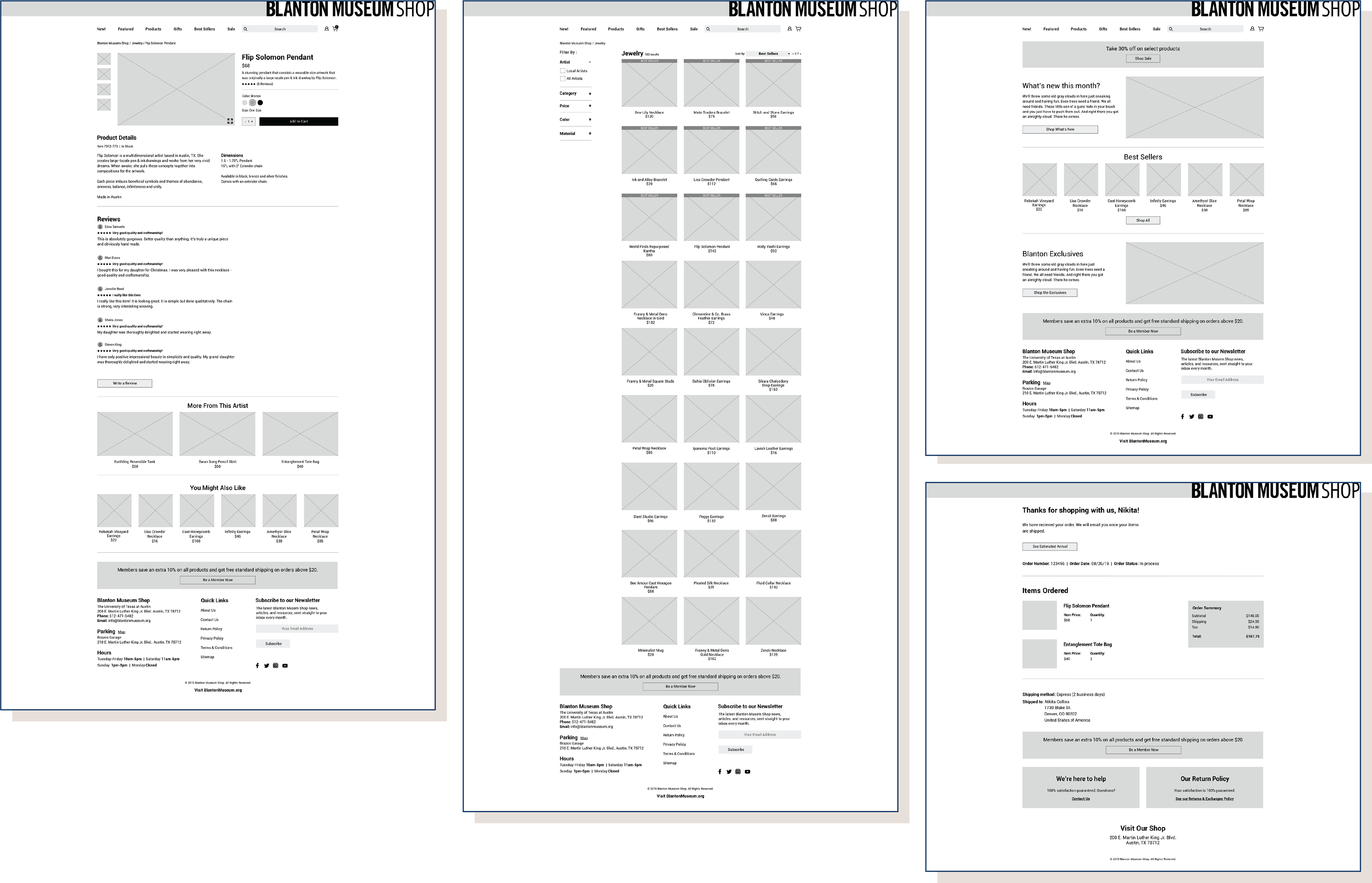
For structure and functionality, I built out wireframes of the website.
Based on some of my sketched ideas, I started to build Wireframes using the Sketch App. I had to go back and forth a lot as I got into more and more details. In hindsight, I wish I had worked more on hand sketches before getting into wireframes.
Prototyping my designs
► I built an interactive prototype using Invision to test out the Blanton Museum shop website with users.
► The users should be able to buy a jewelry product designed by a local artist and then checkout the product conveniently just as my persona, Nikita.
Check out the complete set of wireframes prototype!
Check out the complete set of wireframes prototype!
A round of critiques
The more perspectives, the better especially for design work because you want to make sure that you are solving the problem holistically.
Global Navigation Bar
I had too many options in the Global Navigation Bar that made the Search Bar appear small and congested. The below iterations helped it make it cleaner.
I had too many options in the Global Navigation Bar that made the Search Bar appear small and congested. The below iterations helped it make it cleaner.
Before: I was told in the critique that the ‘About’ and ‘Contact’ links not necessarily have to be a part of the Global Navigation Bar. They can go in the footer. ‘Member’ was a repeat button and wasn’t needed because I already had a member icon on the right of the ‘Search Bar’.
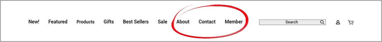
Global Navigation Bar — Before
After: By removing all the extra links, I could make room for a longer search bar and the Global Navigation Bar looked cleaner than before!

Global Navigation Bar — After
I tested the prototyped website with 2 users
► Testing helped me validate the functionality of my designs.
► Testing showed what's working well and what's not.
► Testing showed what's working well and what's not.


Key Insights from Usability Testing (User 1):
► Wants to find pendants by using the Filter.
► Needs to read Return Policy of the product before buying.
► Wants an option to upload a picture of self to see how the
product looks.
product looks.
Key Insights from Usability Testing (User 2):
► Wants to use Search to find pendants or by using the filter under Jewelry.
► Wants to see Best Sellers listed on the products page at the top.
► Wants to know if Membership is free.
► Wants to select the color of the product in the Quick View pop up screen.
Usability Testing led to new iterations:
For me, all the iterations I made after the usability testing, definitely made my design better and purposeful!
Iteration: The Jewelry category page — Filters and Features
Before: There was no pendants category under ‘Filter’ section and the product page was automatically sorted by ‘Featured’ items.
After: I updated the ‘Filter’ section to add Pendants category and the product page is sorted automatically by ‘Best Sellers’ just how Nikita wants it to be.
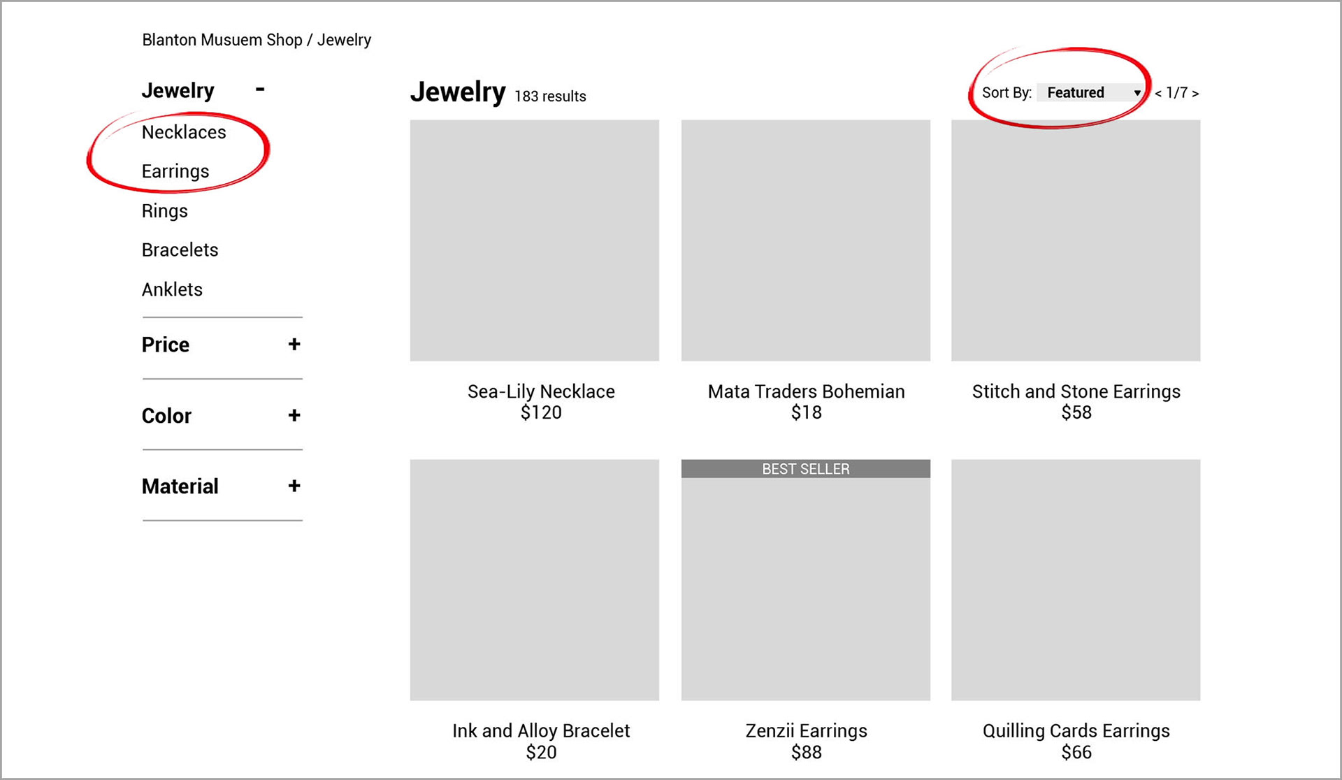
Before
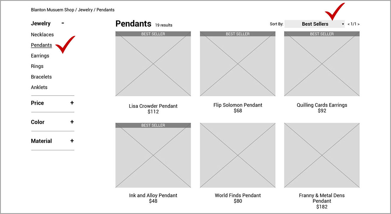
After
Iteration: The Product details page
Before: The Product details were hidden until Nikita clicked on it to read more details. My initial thoughts were that it won’t make the page look cluttered and if they didn’t want to read it, it won’t be in the way. But it ended up creating empty white space on the left.
After: I moved the Product Details to the left of the page and removed the option of it being hidden since Nikita shared that the reason she is on this page is to read the extra details, so why that extra click.
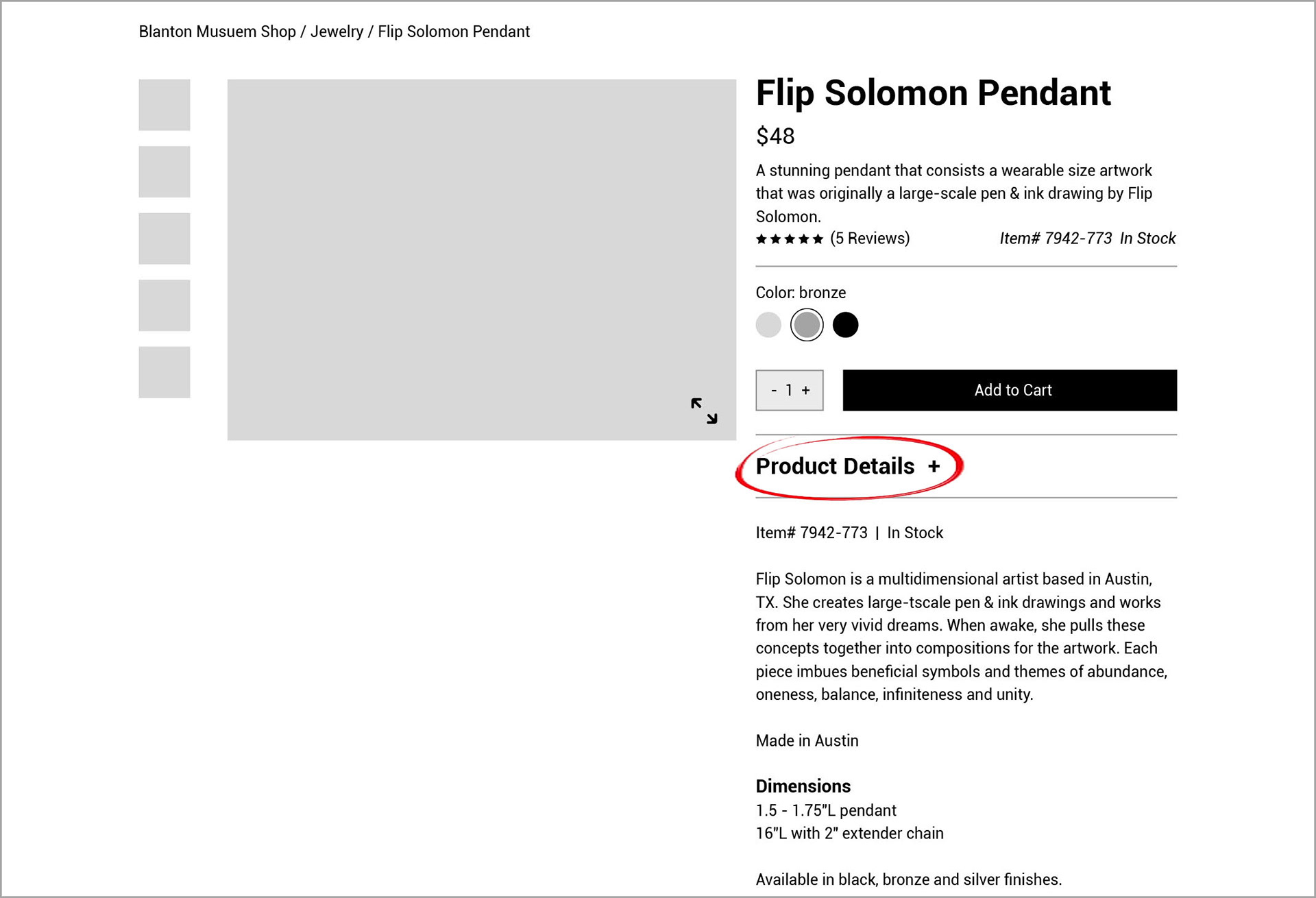
Before
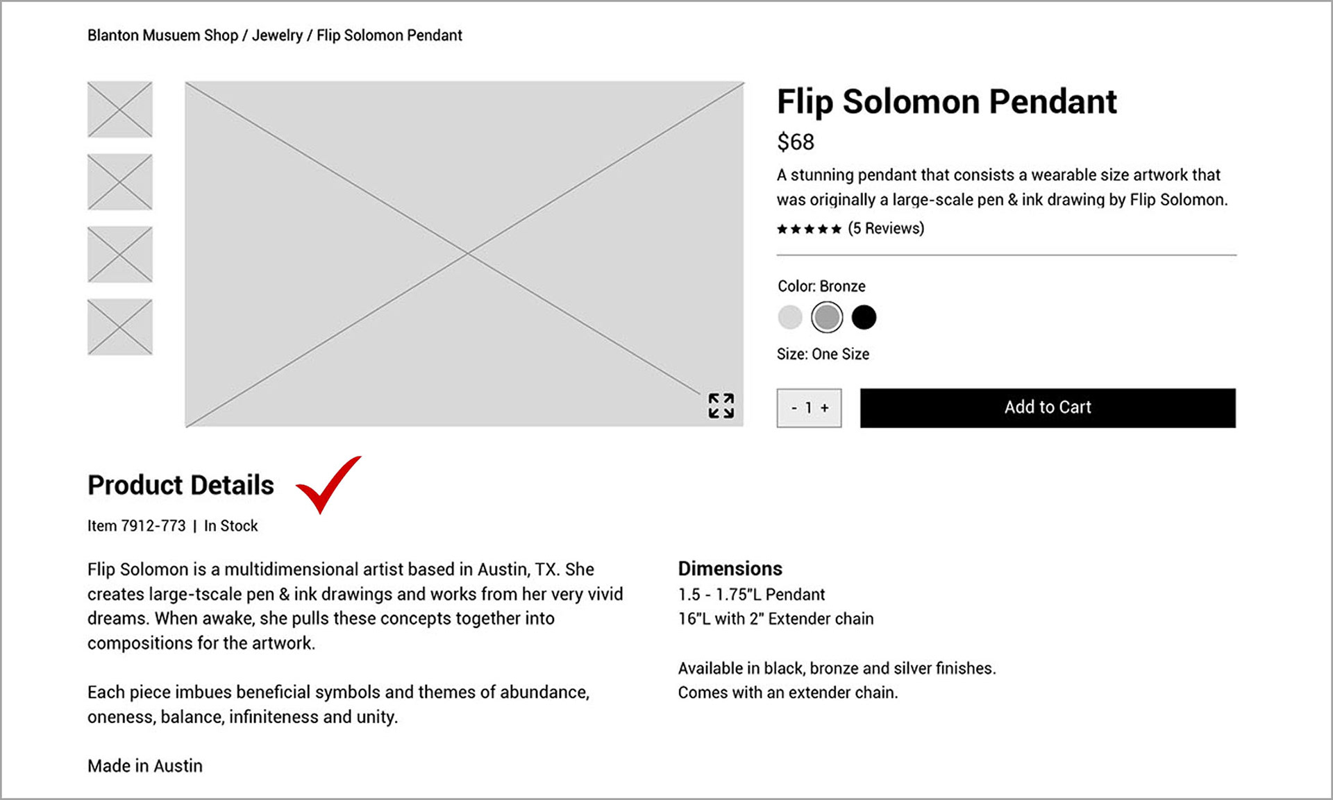
After
Iteration: The Filter on Product page
Before: I did not provide a way to filter by local artists once on the product page.
After: Added the most important ‘Filter’ to sort by ‘Local Artists’ and ‘All Artists’ on each product page.
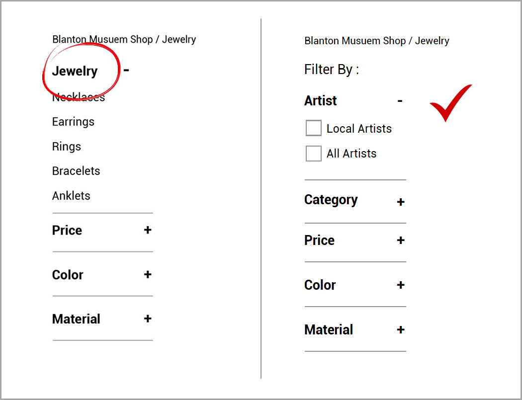
Before and After
Iteration: Footer
Before: Initially I only had the address, contact, parking and hours information in the Footer.
After: I updated it to have Quick links like the About Us, Contact Us, Return Policy and Sign up for the Newsletter option.
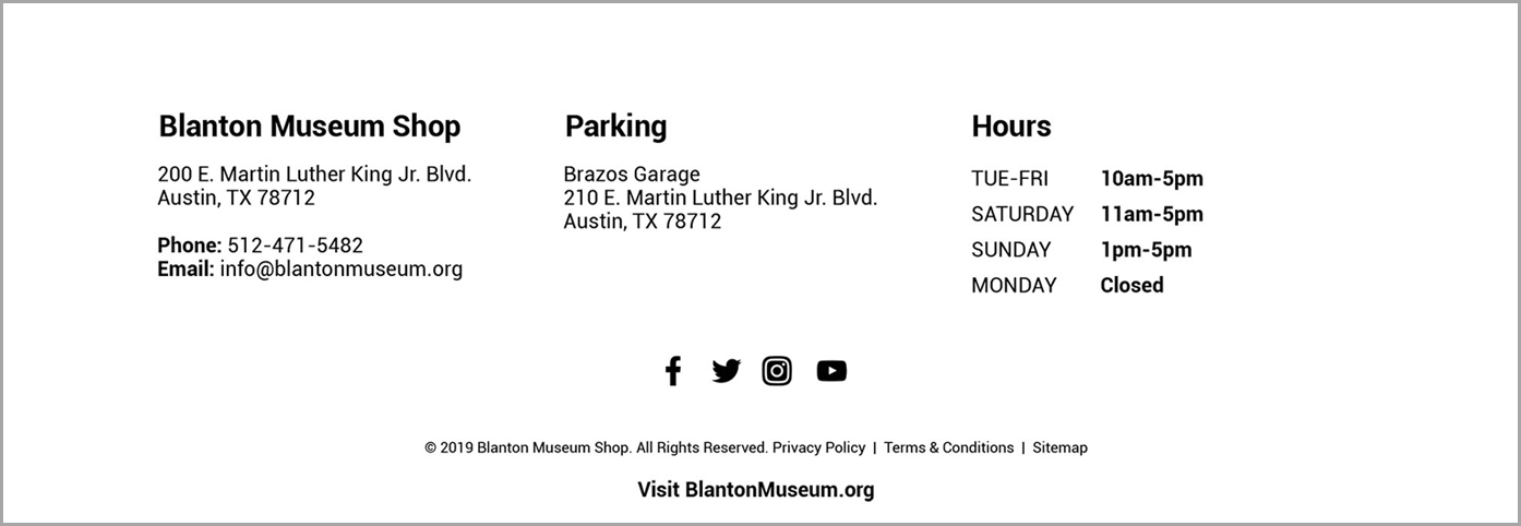
Before
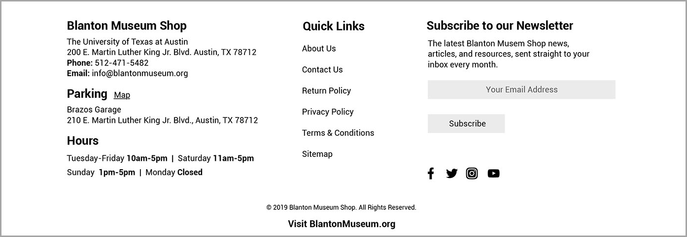
After
What Went Well
► Nikita was able to navigate to the ‘Jewelry’ category under ‘Products’ easily.
► She was able to see pictures, read descriptions and reviews.
► Also, she was able to purchase the product and checkout easily. She liked the ‘More from this artist’ section.
What did I learn?
► My website was partly functional at the time of Usability Testing (Tested only 1 scenario). If I had more time, I would have made it fully interactive to understand it’s functionality as a whole.
► Testing with wireframes prototype was a perfect way to test the functionality for the site.
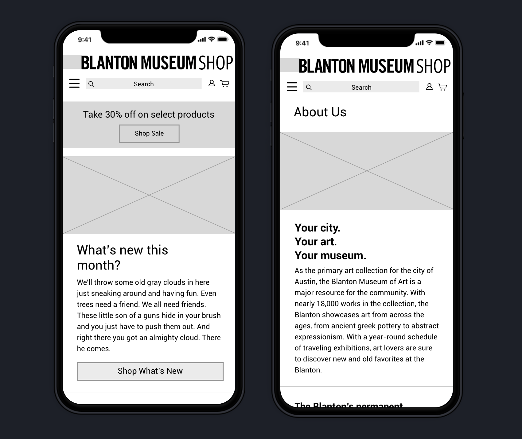
I designed a few screens for the mobile version.
► Although it was a short turnaround time, I designed few of the mobile screens for the Blanton Museum Shop website to show that it’s a responsive website just how Nikita wants it to be!
Next Steps:
If I had more time on this project, I would be interested in building out more.
► Build out the features of the website that are currently not functional.
► Build a fully interactive mock-up of the responsive website.
► Do a final round of usability testing with colors, fonts and all features in place.